The Best School Websites: 16 Real Examples and What Makes Them Work
The Best School Websites: 16 Real Examples and What Makes Them Work
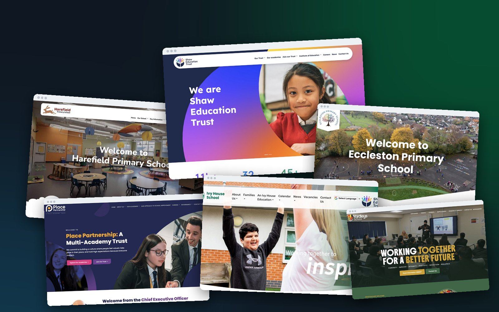
The best school websites look stunning, and they work just as hard as they look. A parent finds the term dates in seconds, a Year 6 family gets a real feel for the school community before they visit, and the office can keep everything up to date between other jobs.
Below are 16 of the best school websites we have designed for primary schools, secondary schools, a sixth form, a special school and multi academy trusts, with what each one does especially well. After the examples you will find what the best school websites have in common, a checklist to test your own site, and the mistakes we see most often.
16 of the best school websites, and what they get right
Every example is a live school website designed, built and supported by Schudio. Filter by type of school, and hover over a screenshot to scroll down the whole page.
01Primary school
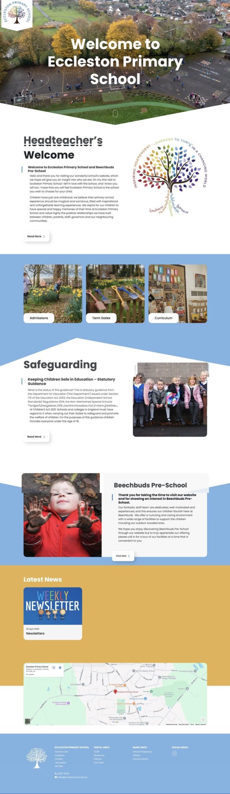
Eccleston Primary School
A drone photograph of the school and its grounds opens the website, so prospective parents see the whole site before they visit. Admissions, term dates and curriculum sit in large photo tiles straight underneath, and safeguarding has its own section rather than a link in the footer.
02Primary school
Harefield Primary School
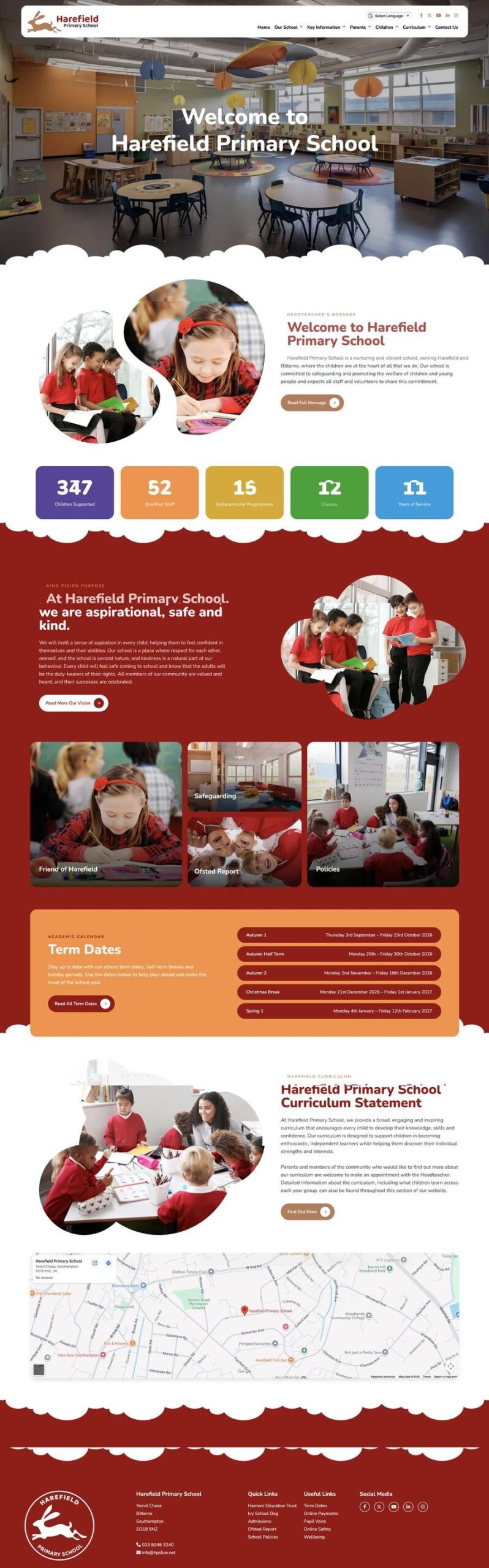
Warm, confident and unmistakably Harefield. Playful cloud dividers carry the brand down the page, bold coloured statistics tell the school’s story at a glance, and the school calendar is right there on the front page, which is exactly where parents look for it.
03Primary academy
Devonshire Primary Academy
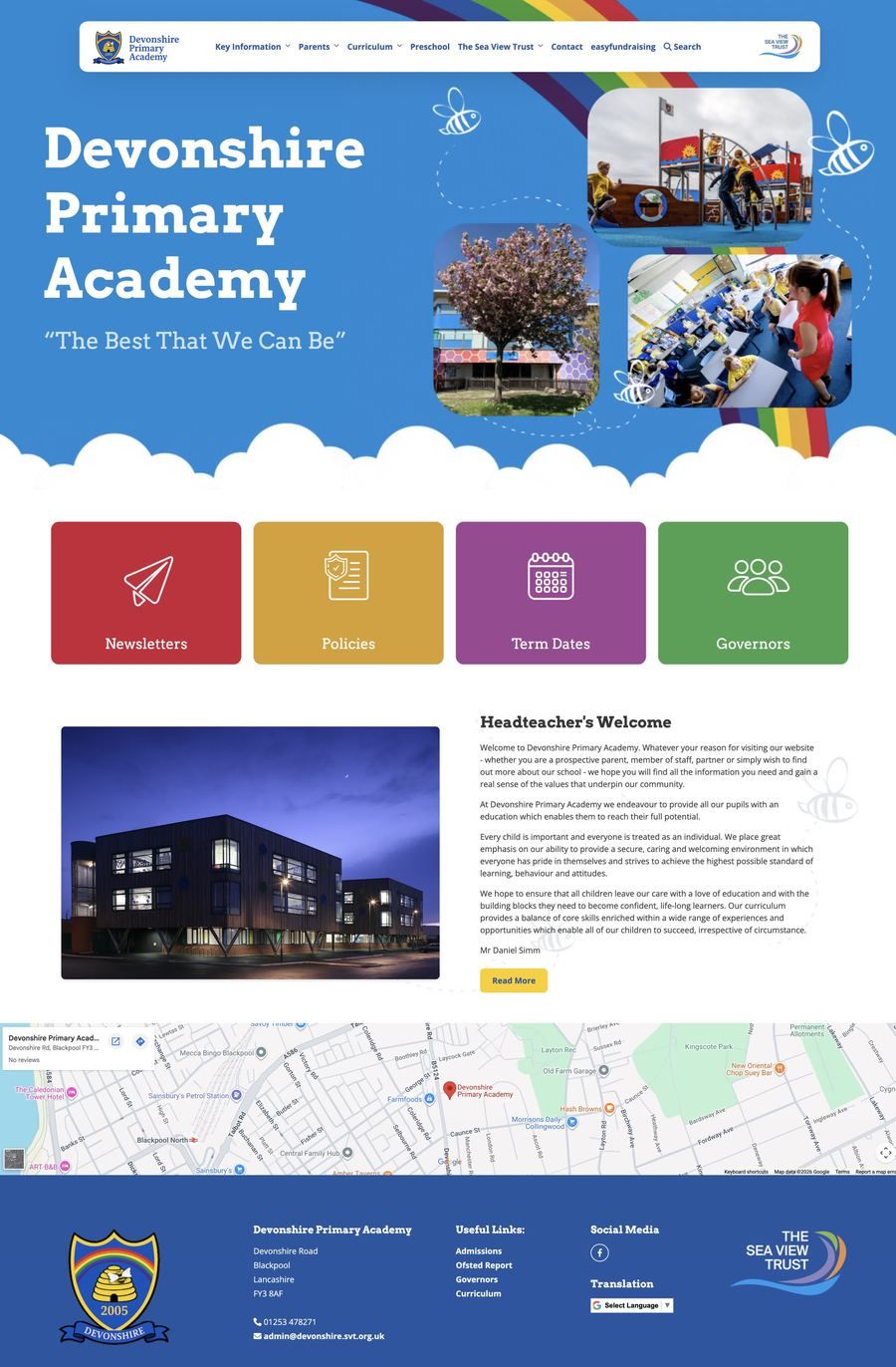
Bright, joyful and built for busy parents. The rainbow, bees and school motto make a memorable first impression, and four big icon buttons for newsletters, policies, term dates and governors get people where they need to go in one tap on a phone.

04Secondary school
St George’s School, Blackpool
A premium, dark navy design built around the school motto, with headline figures, a video on what makes the school distinctly Christian, and admissions information laid out in clear cards. It shows how bespoke design can carry a school’s whole identity.
05Secondary school
Yardleys School
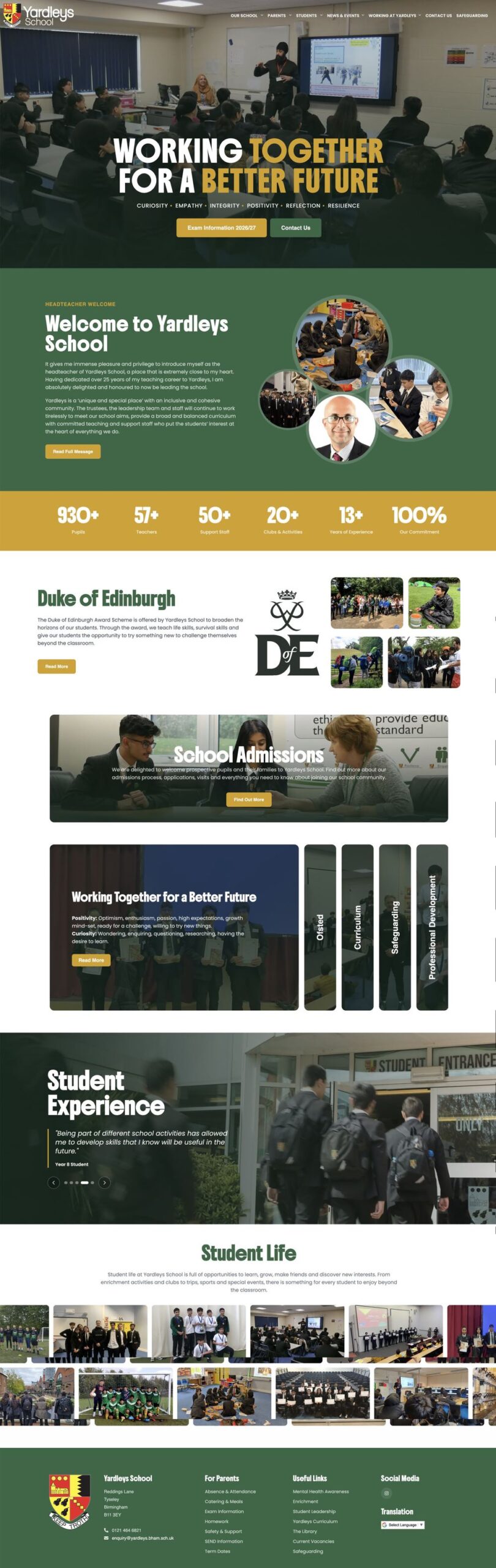
The school’s values run in a strip beneath the headline, a gold statistics band shows achievement at a glance, and Ofsted, curriculum and safeguarding sit in neat vertical tabs. A wall of photographs then shows real student life.
06Catholic college
Bishop Challoner Catholic College
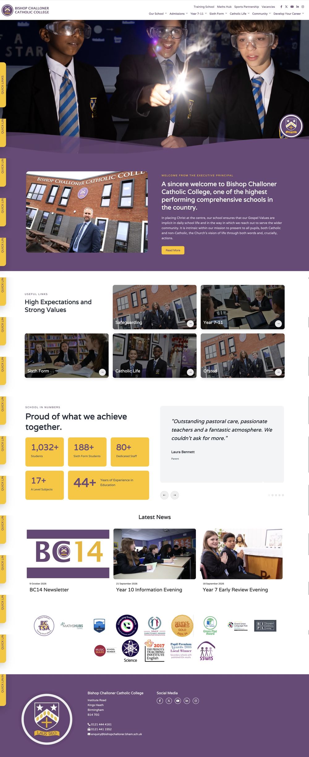
A rich purple brand, a hero image of students in a science lab, and photo quick links for Years 7 to 11, the sixth form, Catholic life and Ofsted. Achievement figures sit beside a real parent quote, which is far more persuasive than a claim on its own.
07Catholic high school
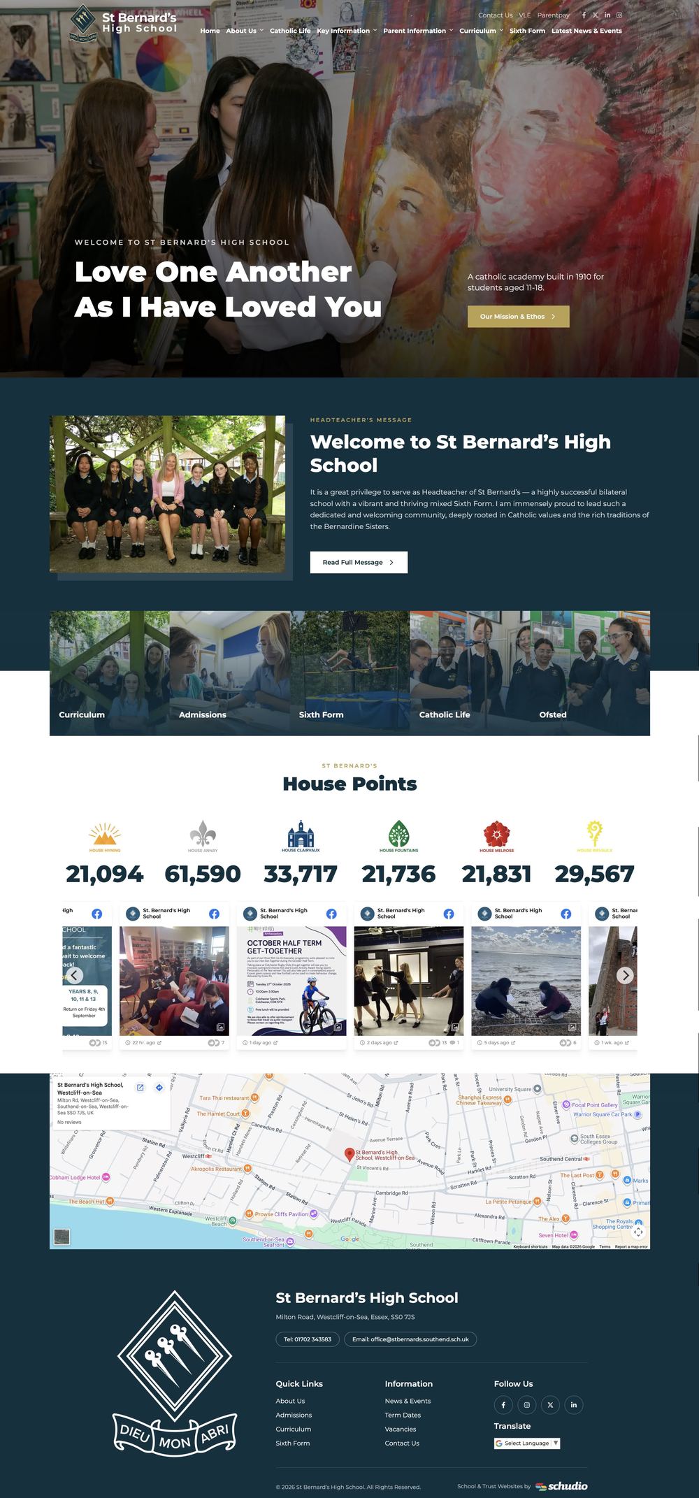
St Bernard’s High School
The school motto leads, and a live house points board turns the website into something students actually want to check, and helps the whole school community feel involved. News updates in a carousel, so the site always looks current.

08Secondary school
Cockermouth School
A clean, confident layout with six photo quick links for admissions, staff, term dates, the sixth form, curriculum and contact. Upcoming events run along a timeline and a social media feed keeps the site fresh without extra work for teachers or the office.
09High school
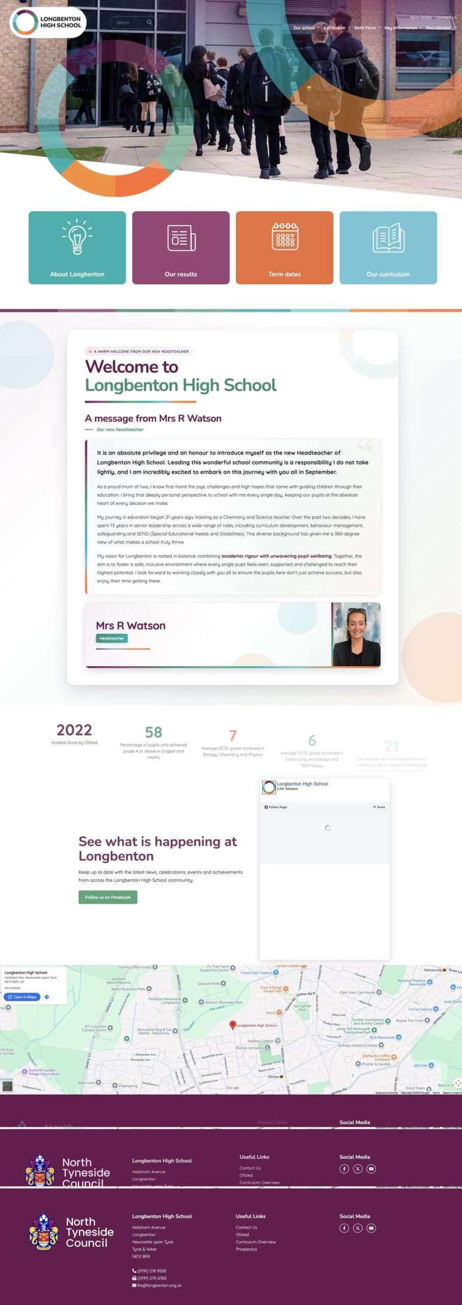
Longbenton High School
A distinctive circle motif from the school’s brand runs through the whole design. Four coloured tiles for results, term dates and the curriculum sit right under the hero, and a personal welcome from the headteacher makes the school feel approachable.
10Sixth form
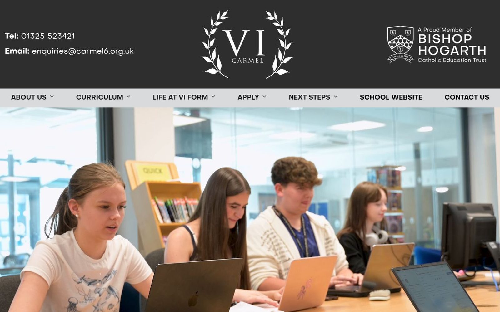
Carmel VI Form
Written for sixteen year olds as much as their parents. A clean, monochrome brand, real students front and centre, and a menu built around life at the sixth form, applying and next steps, so the route from first visit to application is obvious.
11Special school
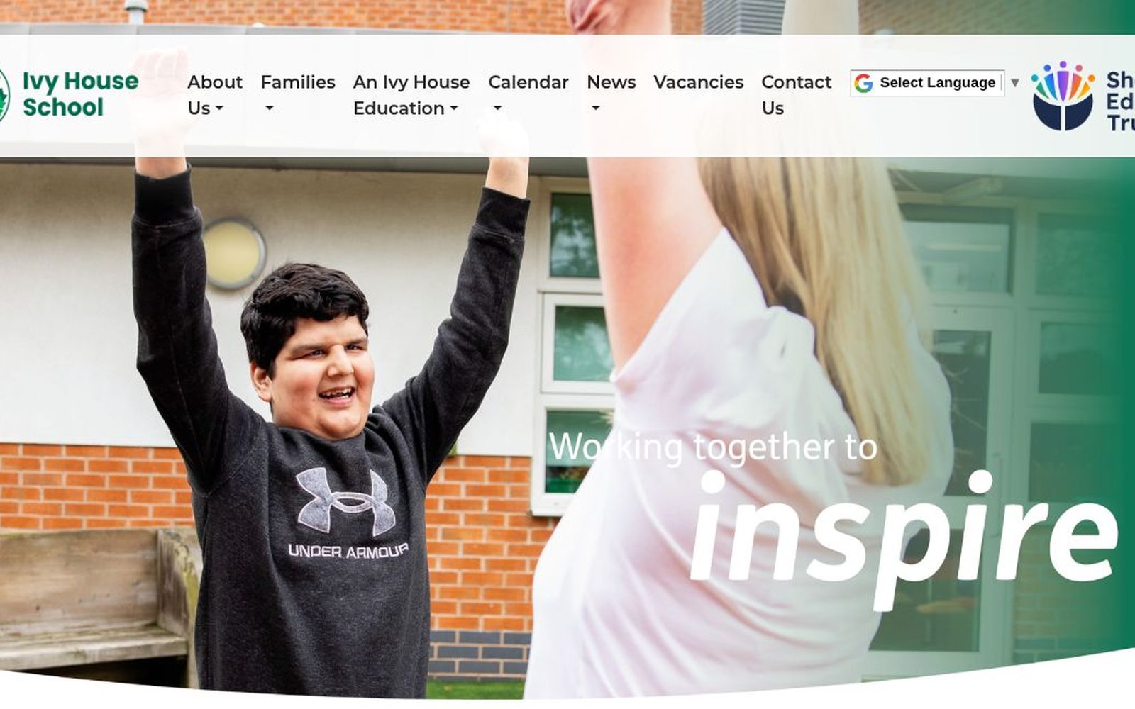
Ivy House School
Calm, uncluttered and full of joy. A single strong photograph, the words ‘working together to inspire’ and a short, plain menu for families, calendar, news and vacancies make the site easy for every family to use, with translation built in.
12Multi academy trust
Shaw Education Trust
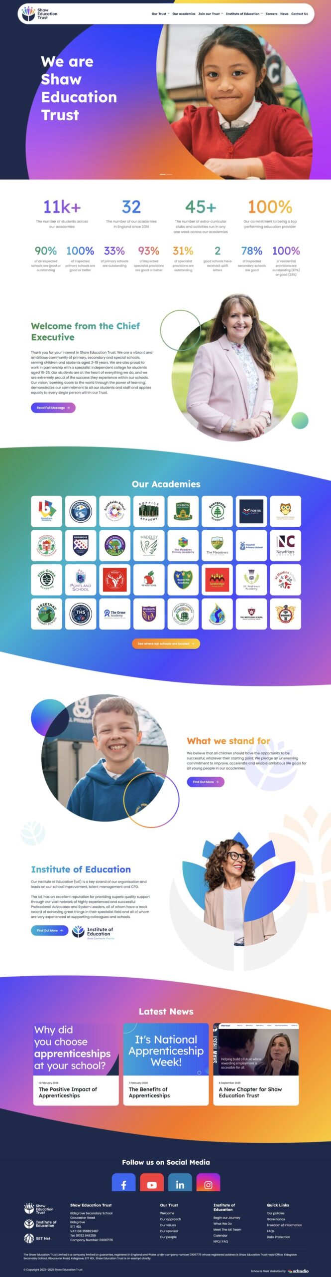
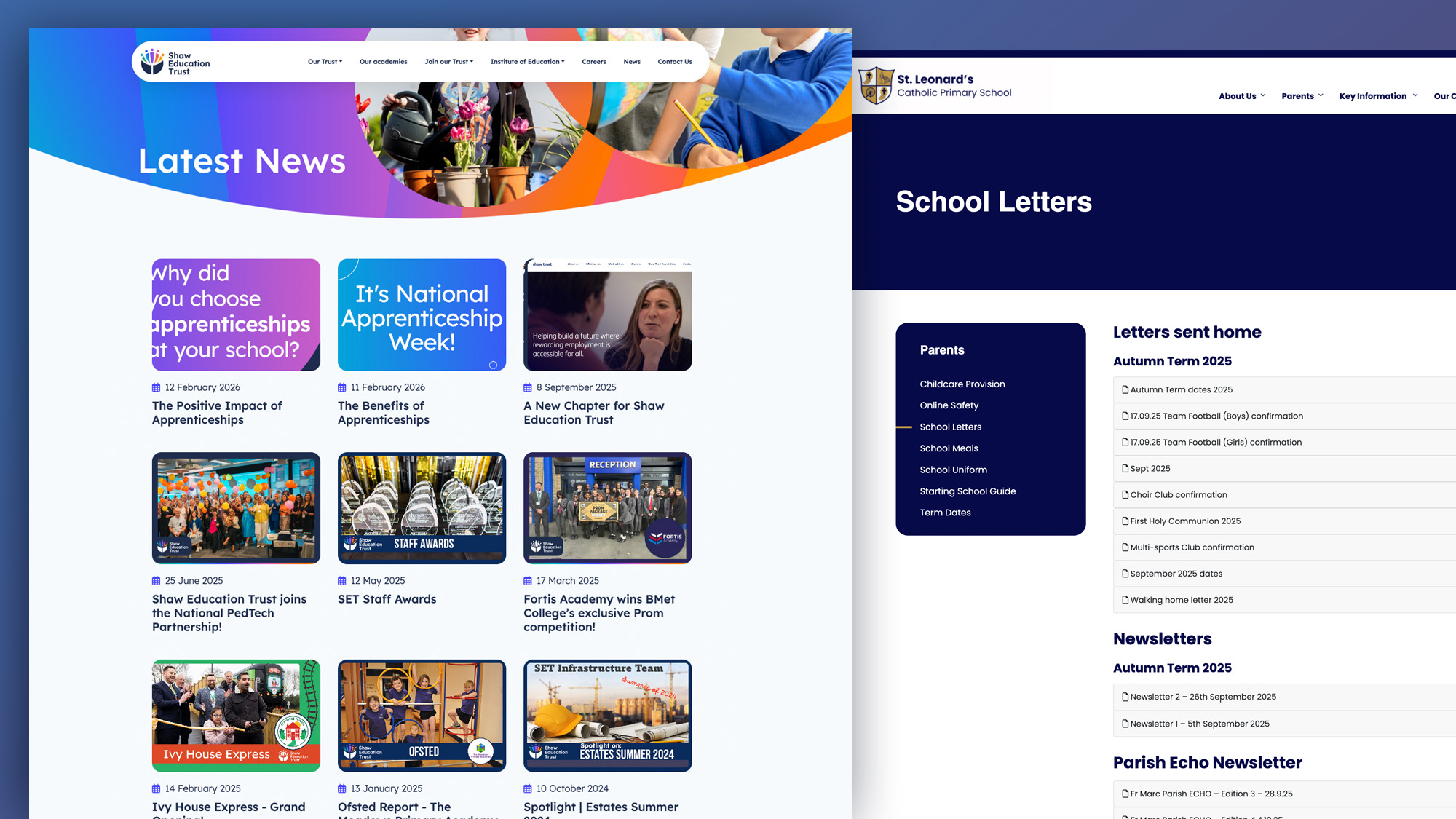
A vibrant gradient brand that feels like the trust, not a template. Headline figures, a welcome from the chief executive and a grid of every academy’s crest show the scale of the trust while each school keeps its own identity.
13Multi academy trust
Place Partnership
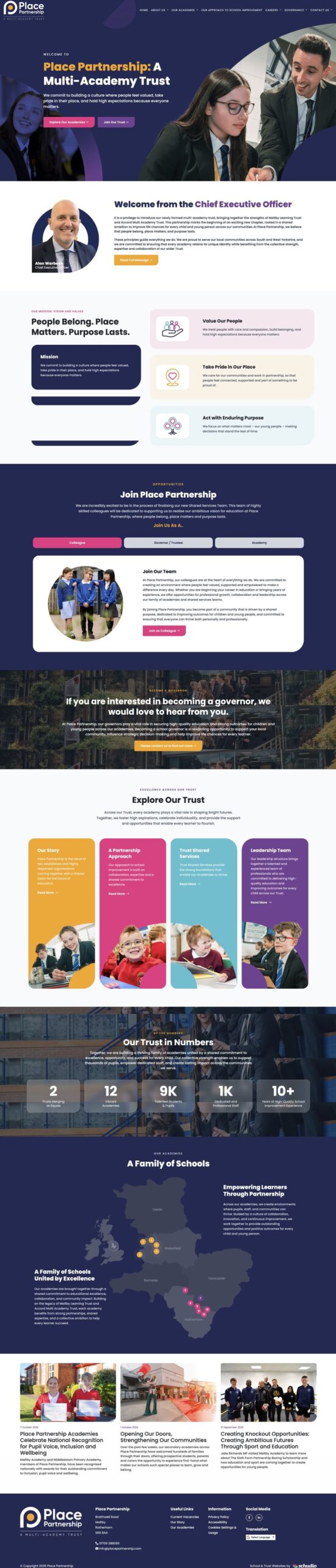
‘People belong. Place matters. Purpose lasts.’ The trust’s values lead, recruitment has a section of its own, there is a clear call for new governors, and a map of the region shows exactly where every school in the family sits.
14Multi academy trust
Grace Schools
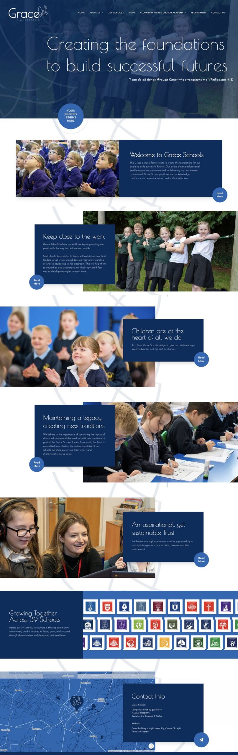
Elegant and calm, with a scripture verse in the hero and a series of photo and text panels that tell the trust’s story one idea at a time. Every school’s crest sits together, showing a family of schools growing together.
15Catholic academy trust
Sancta Familia Catholic Academy Trust
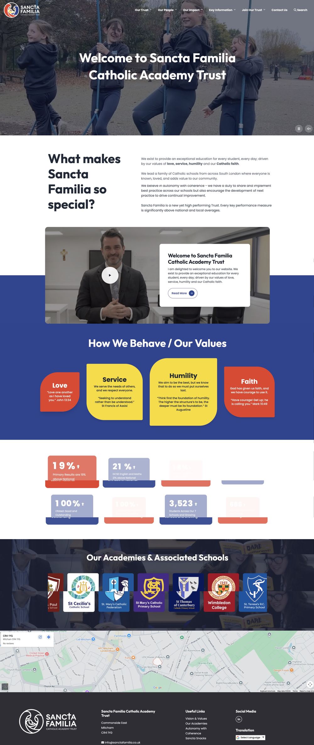
A video welcome, the trust’s four values of love, service, humility and faith in bold coloured cards, and a strip of every academy and associated school. Warm, human and clearly Catholic.
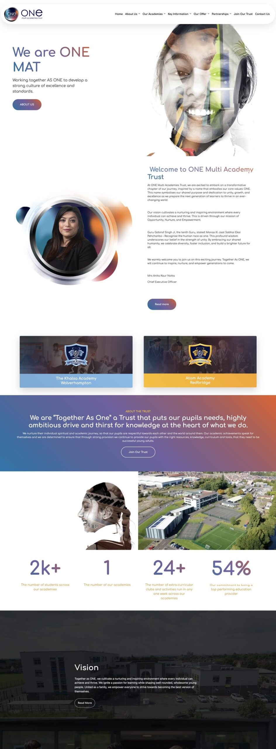
16Multi academy trust
ONE Multi Academies Trust
Striking art direction: duotone portraits and a bold ‘Together as One’ statement make this trust instantly recognisable. Academy cards, headline figures and an aerial photograph keep it grounded in real schools.
What the best school websites have in common
Look across all 16 examples and the same six things come up again and again, whatever the size or type of school.
- 1
They are built for parents on phones
Most visitors arrive on a smartphone, often in a hurry. The best school websites are user friendly on various devices, from phones and tablets to desktops, with big tap targets and the most important links first.
- 2
The essentials are never more than two taps away
Term dates, letters home, the calendar, contact details and admissions. Every example above puts them in quick links near the top of the page, with intuitive navigation behind them.
- 3
They look like the school, not a template
High quality images of real students and staff, the school’s own colours and crest, and its values in its own words. A great school website reflects the school’s unique character from the first screen.
- 4
They are kept up to date
Outdated news is the fastest way to lose a parent’s trust. The best sites make updates easy for staff, so news, events and documents stay current week after week.
- 5
They speak to every audience
Prospective families, current parents, students, teachers, governors and the wider community all need a clear way in. Good navigation gives each of them a route without crowding the front page.
- 6
They are accessible and compliant
Clear contrast, alt text, plain language and the information schools are required to publish, kept in place and kept current. Accessible design helps every visitor, not just some.
How does your school website measure up?
Open your school website on your phone and tick each statement that is true. Nothing is saved or sent anywhere.
Tick the statements that are true for your website.
Need a hand with the ones you could not tick? Our school website requirements guide and free tools, including the Reading Age Checker and Accessibility Statement Generator, are free for any school.
Five mistakes that stop a school website being one of the best
Everything is a PDF
Letters, policies and menus uploaded as PDFs are hard to read on a phone. Put the important information on the page and keep documents for the formal versions.
The news stopped in July
A front page whose latest story is months old tells families the website is not looked after. Little and often beats an occasional big update.
Stock photography
Parents can spot a stock photo instantly. Your own pupils, staff and buildings, with the right permissions, always say more.
Term dates are hidden
It is one of the most visited pages on any school website. If it takes more than two taps to find, move it.
Writing in staff language
Acronyms and jargon make sense in the staffroom but not at home. Write for a parent reading on a phone between other jobs.
School website questions, answered
What makes a school website good?
A good school website is easy to use on a phone, shows the school’s real character, keeps term dates, news and events current, publishes the information schools are required to show and is easy for staff to update. The best school websites do all of that and still feel welcoming to a family visiting for the first time.
How often should a school website be updated?
Little and often. News and events every week or two, term dates as soon as they are confirmed, and policies on their review dates. A site that is updated regularly builds trust with parents and stays compliant.
What must a school website include?
Schools in England are required to publish specific information online, from admissions arrangements and Ofsted reports to curriculum, behaviour and SEND information. Our free school website requirements guide lists it all, with where each requirement comes from.
How much does a new school website cost?
It depends on the type of school and how bespoke the design is. Schudio primary school website packages start from £475 a year plus VAT with no setup fee, and secondary schools, sixth forms and trusts are quoted for their own needs.
Want your school website to be one of the best?
Every website on this page started with a conversation. Tell us about your school and we will show you what a new website could look like, whichever type of school you are.

Related Posts

Ian Richardson
September 30, 2026
What schools should not use AI for, the AI safeguarding risks behind each limit, what KCSIE 2026 now says, and a practical checklist for school leaders.
Ian Richardson
September 16, 2026
Introducing the Schudio AI Suite: AI school website software that checks what you publish, drafts pages in your school's voice and answers parents' questions.
Ian Richardson
July 29, 2026
What parents look for in a school, and how your website answers it before they visit: culture, safeguarding, SEND support and clear practical information.
Ian Richardson
June 24, 2026
A school website says a lot before a parent reads a full page. Parents make ..
Luke Smith
June 24, 2026
School website news is one of the easiest ways to show parents, pupils and prospective ..
Luke Smith
June 17, 2026
A school website newsletter is one of the simplest ways to keep parents informed, make ..