School Website Image Sizes, and a Free Tool to Get Them Right
The images a school website actually needs, at the right pixels, measured from live school sites, plus a free tool that turns one photograph into every one of them. No sign-up, and your images never leave your device.
Add your image
JPG, PNG, WebP or GIF. Nothing is uploaded anywhere, the resizing happens on your own device.
Choose how it should fit
Tick the sizes you need
Pick a bundle to start, then add or remove anything you like.
Download your set
Why school website images come out wrong
You take a lovely photograph at sports day and it goes everywhere: the website, the newsletter, a couple of social accounts. Somewhere along the way a child loses the top of their head, the crest ends up half in frame, and the whole thing looks slightly soft.
Three things are going on, and none of them is your fault.
The shape. Your website and every social platform crop uploaded images to their own frame. When the shape you give them does not match, they decide what to cut, usually from the centre outwards. They do not know the important part was the child on the left. Choosing the focal point yourself is the fix, and it is why this tool gives you a nine point focal point control rather than cropping blindly.
The resolution. Uploading images larger than the slot needs is fine, and uploading them smaller never is. Enlarging loses visual quality permanently. Saving photos at the target size before uploading means less compression is applied on the way in, so more of the picture survives.
The weight. Oversized images are the most common cause of slow loading speed on a school website. A 6MB photograph in a 720 pixel slot costs every visitor, and it costs parents on a phone most of all.
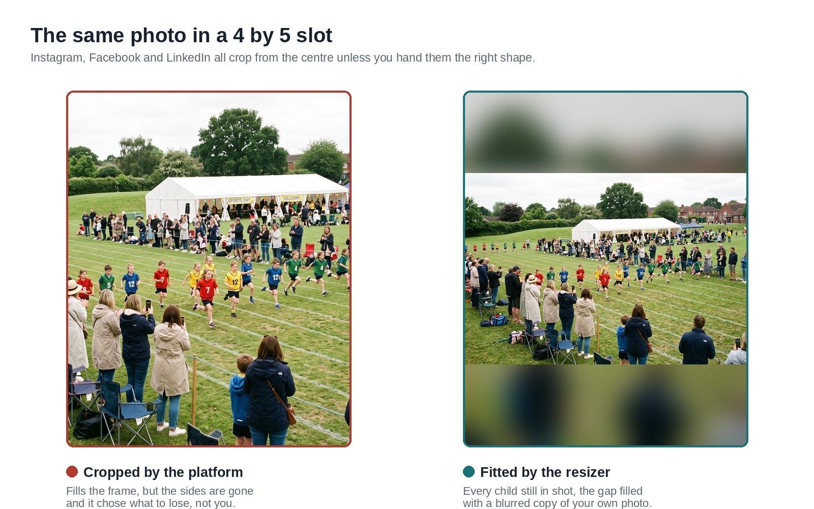
The same photograph in the same slot. On the left the platform chose what to keep.
School website image sizes
These are the images a school website needs, and the pixel sizes each one wants. The Schudio figures are not estimates: we measured them from the image cache on 265 live Schudio school websites in August 2026, so they are the exact dimensions the content management system crops to. Match the shape and nothing important gets trimmed.
School website
| Where it goes | Pixels | Worth knowing |
|---|---|---|
| Homepage hero banner | 2000 x 800 | Wide banner across the top of the homepage. Phones crop the sides, so keep faces and any text near the middle. |
| News thumbnail | 720 x 440 | The picture in a news list. It is seen small, so pick something that still reads at postage stamp size. |
| Staff photo | 600 x 600 | Square headshot for a staff page. Frame from the shoulders up and leave a little headroom. |
| Gallery photo | 1600 x 1200 | Big enough to look sharp full screen without making the page slow to load. |
| Website share image | 1200 x 630 | What appears when someone shares a page of your site in a message or a post. |
| Newsletter header | 1200 x 400 | Export at double size and display it at 600 wide in the email so it stays sharp on phones. |
| Prospectus cover, A4 at 300dpi | 2480 x 3508 | Print resolution A4 portrait. Only use a photo that is genuinely large enough, print is unforgiving. |
Schudio CMS
| Where it goes | Pixels | Worth knowing |
|---|---|---|
| News image | 720 x 440 | The exact size Schudio crops news images to, on 85 percent of live Schudio sites. Match this shape and nothing important gets trimmed. |
| Homepage banner | 2000 x 800 | The most common Schudio banner size. Keep your crest and any wording near the middle, because the sides go first on a phone. |
| Homepage banner, widescreen | 1920 x 1080 | The other banner size some Schudio themes use. If you are not sure which your site has, right-click your current banner and look at the image address. |
| Section tile, standard | 720 x 440 | The picture on a menu or section tile. Around half of Schudio themes use this shape and half use the square below. |
| Section tile, square | 720 x 720 | The square menu tile used by the other half of Schudio themes. |
| Homepage feature tile | 1024 x 1024 | The large square feature tile on the homepage. |
| Staff photo | 360 x 360 | Schudio crops staff photos square and displays them small, so a head and shoulders crop works far better than a full length photo. |
| Gallery image | 720 x 440 | The standard gallery crop. |
| Gallery image, square | 720 x 720 | The square gallery crop used by some themes. |
| Content block image | 1000 x 1000 | The square image used inside a content block. |
If your website runs on something else, the pattern still holds. Find one of your own images, right click it, and look at the address. Most school content management systems put the width and height they crop to straight into the image path, so you can read the pixel sizes off your own site in a few seconds.
Image sizing before uploading, in practice
Good image sizing is mostly one habit: get the file right before uploading it, rather than hoping the website sorts it out. These are the resources and habits that make image sizing quick for an office team, and none of them need a designer.
Start from the biggest version you have. Aim for 4000 pixels on the long edge. Images can always be resized down and stay sharp. Going the other way never works, and this tool tells you plainly when an output has been enlarged rather than handing you something soft without saying so.
Select images carefully for the slot. A wide group photograph will never sit well in a square staff frame. For small slots, pick pictures with one clear subject; a busy scene turns to mush at thumbnail size.
Save in the right file format. JPG for photographs, PNG for crests and anything with transparency, WebP when you want the same visual quality at a smaller file. Quality of 92 percent is a sensible default; above that you are adding weight for no visible gain, and the compression that platforms apply afterwards will undo it anyway.
Do the whole set at once. Resized copies for every place a picture is going, made in one pass, saves the afternoon of repeated cropping that this normally becomes. New images added later are quicker if you keep the originals somewhere sensible.
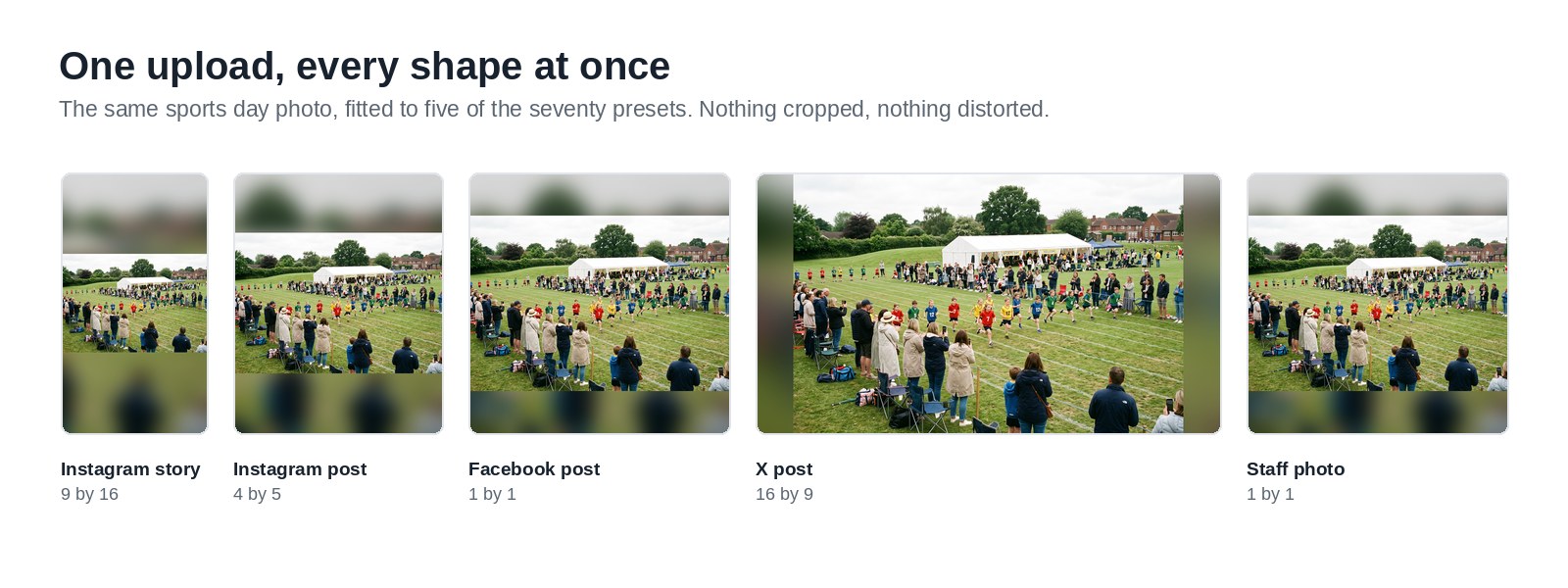
One photograph, fitted to five different slots. Nothing cropped, nothing distorted.
Banners, and why they lose the crest
Banner images are the ones schools get caught by. A YouTube channel banner is a single image shown at four different crops depending on whether someone is watching on a phone, a tablet, a laptop or a television. The canvas is 2560 by 1440, but only the middle 1546 by 423 is guaranteed to appear on all of them. Facebook covers and LinkedIn banners behave the same way, and so does the hero banner on most school websites.
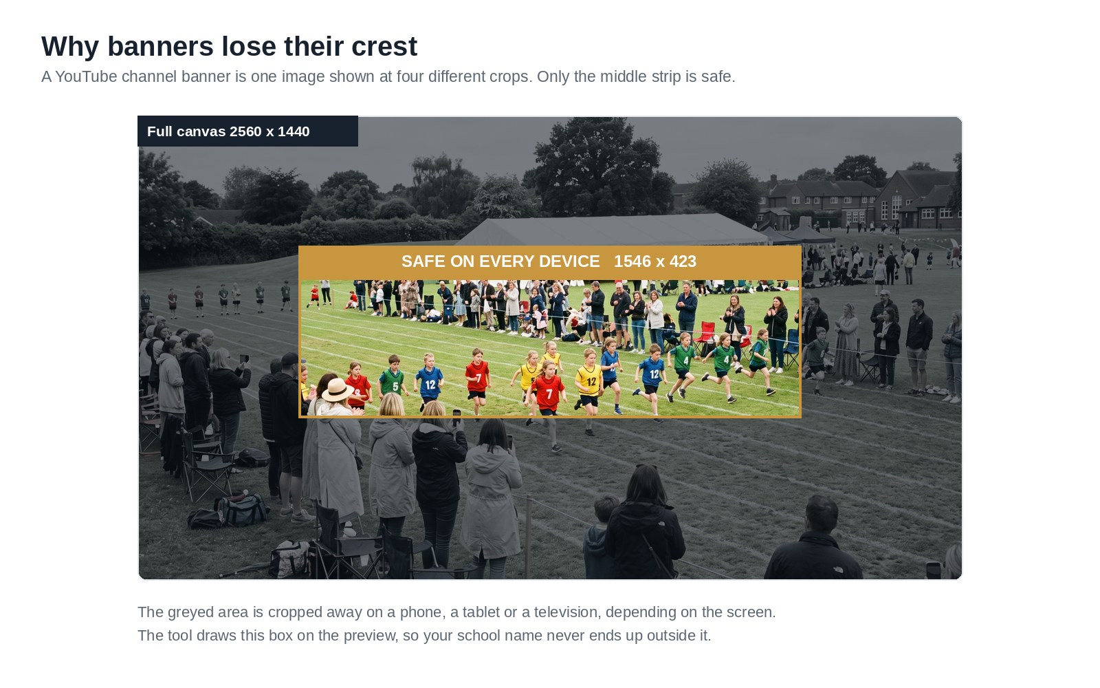
Design for the smallest crop rather than the biggest canvas. Where a preset has a safe area, the tool draws it straight onto the live preview, so you can see what will survive before you export anything.
Width, height and why banners are the awkward ones
Most images on a school website are judged on width. A browser lays the page out by width first, then fits the height around it, which is why a banner that looks right on a desktop can crop badly on a narrow screen.
Two numbers are worth knowing for any slot. The display width, meaning how wide the images actually appear on the page, and the pixel sizes the system stores them at. Those are rarely the same. A hero banner might display at 1200 pixels wide on a laptop but be stored at 2000, so that it still looks sharp on a high resolution screen.
The practical rule: supply images at least as wide as the largest width they will ever be shown at, and match the shape. Getting the width right matters more than getting the height right, because the height is usually cropped for you.
Video thumbnails and cover images
Video is the one schools forget. A video thumbnail is just an image, and it follows the same rules as every other image on the page. YouTube wants 1280 by 720 pixels and refuses anything over 2MB, so a large file has to come down before uploading. If you leave it, YouTube picks a frame for you, and it is almost always a blurred half blink.
A video cover image is worth choosing deliberately, because it is the only part of the video most people ever see. Pick a frame with one clear subject, save it at the right pixels, and check it still reads at thumbnail size on a phone. The presets for video thumbnails and community posts are in the tool at the top of this page.
Built for schools
Your photographs stay on your device
Most free tools upload your file to a server. Ours does not. Every resize happens in your own browser, so a photograph of your pupils never leaves the laptop it is sitting on. No account, no upload queue, nothing for us to store.
School sizes, not shop sizes
Alongside the social platforms you get what schools actually need: website hero banners, news thumbnails, staff headshots, gallery images, newsletter headers and an A4 prospectus cover at print resolution. We left out the Etsy and Amazon listing sizes, because no school has ever needed one.
Nothing is cut off by default
The default keeps every pixel and fills the space around it with a blurred copy of your own photograph, a solid colour, a gradient, mirrored edges or transparency. Crop only if you want to, and choose the focal point when you do.
Common questions
What size should images be on a school website?
Does uploading a bigger image make the page slower?
Will this work with our website?
Is it free?
While you are here
Schudio builds websites for schools and trusts, and keeps them compliant all year round rather than in a panic before an inspection. A free audit is a straightforward place to start.
Also worth a look, our free accessibility statement generator.