What Parents Actually Notice on a School Website
What Parents Actually Notice on a School Website

A school website says a lot before a parent reads a full page.
Parents make quick judgements. Some are obvious. Some are quieter. They notice whether the school website feels current, warm, clear and easy to use. They notice whether they can find the details they need. They notice whether the school feels active, well cared for and trustworthy.
For many families, the school website is the first real contact they have with a school. They may visit before booking a tour, making an admissions enquiry, choosing between schools, looking for support, checking Ofsted inspection reports, finding performance data or working out what life would be like for their children.
Good school website design is not just about making a site look smart. It shapes first impressions. It supports school communication. It helps parents choose with more confidence.
The best school websites make parents feel that the school is clear, caring and easy to deal with.
Here are the things parents actually notice when they visit a school website.
Parents notice whether the school website feels current
One of the first things parents notice is whether the website feels looked after.
They may not check every date or read every page, but they pick up signals quickly.
They notice:
- old dates on the homepage
- expired event notices
- broken links
- outdated staff names
- older school policies
- missing term dates
- blank pages
- a quiet news area
- old admissions details
- files that no longer feel relevant
This does not always mean the school is disorganised. Often, it just means the website has not had a regular refresh.
But parents do not see the internal reason. They see the impression.
A current school website builds trust. It says, “This school pays attention. This information is being cared for. You can rely on what you find here.”
Regular school website audits help schools keep the site working well, protect compliance and spot small issues before they become bigger problems.
Parents notice the first impression
First impressions happen fast.
Parents notice the design, images, colours, wording and layout before they read the detail.
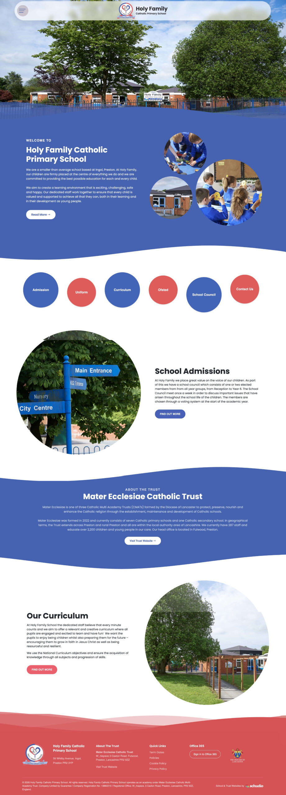
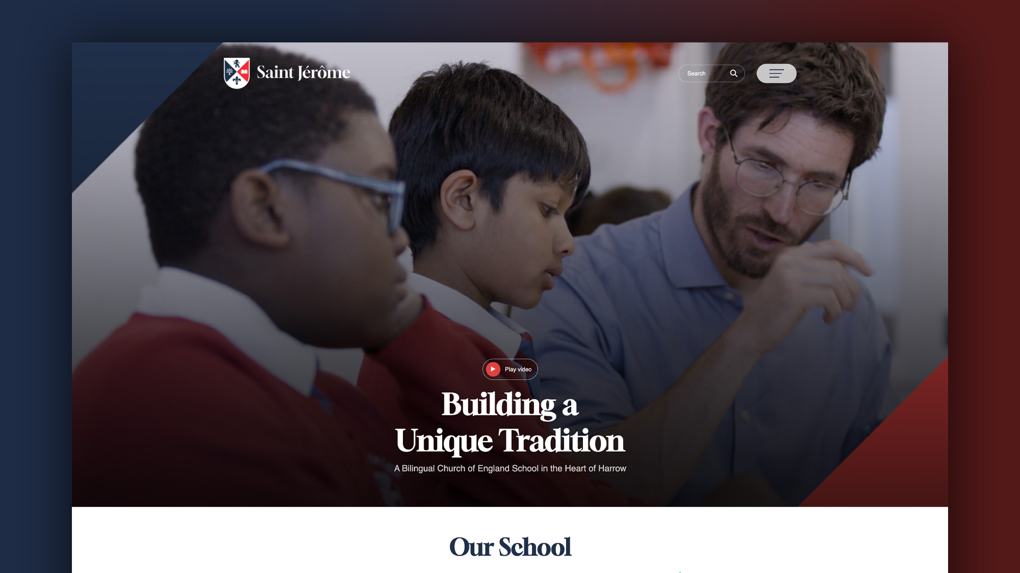
A modern school website should feel warm, clear and welcoming. It should reflect the school’s unique character. It should help visitors understand who the school is, what it values and what kind of care children and young people receive.
This matters for primary schools, secondary school websites, academies and independent schools.
The school website should feel designed specifically for the school, not like a generic template with a logo added at the top.
Good branding can help. School colours, a clear logo, strong photography, warm headings and thoughtful page layouts help build a sense of identity.
Parents notice whether the school feels real.
Parents notice visual warmth
Visual warmth is one of the biggest parts of school website design.
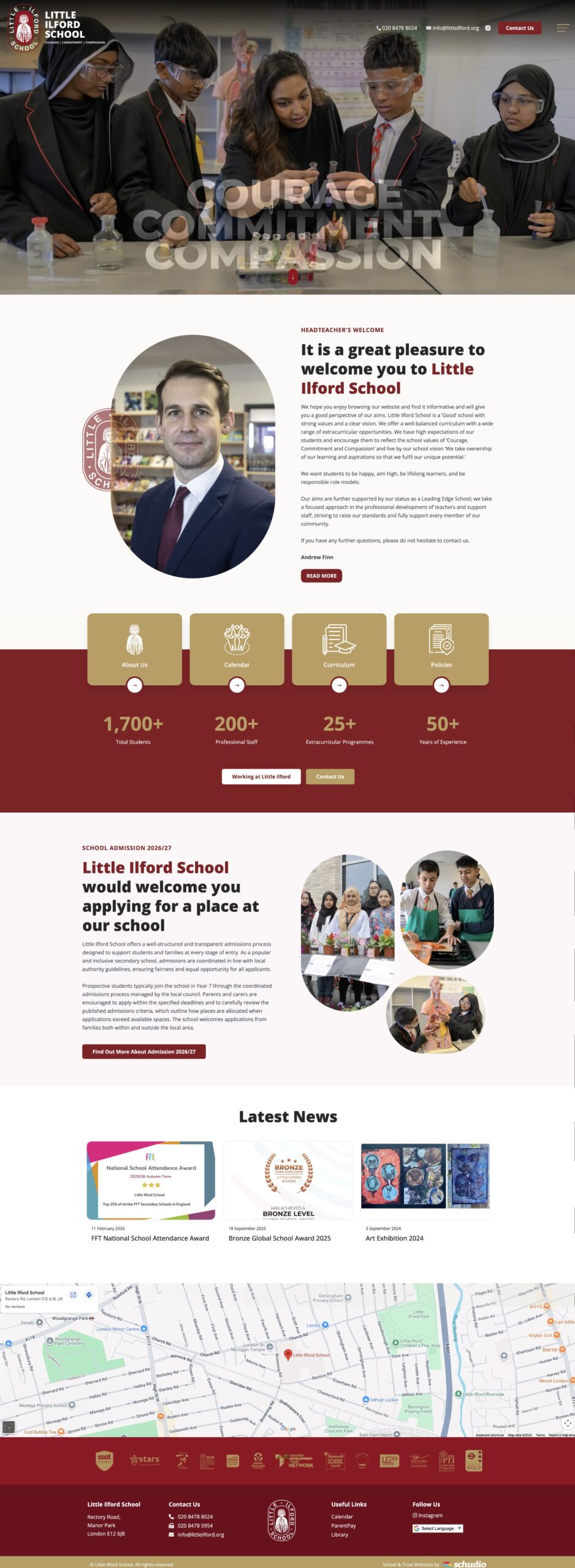
Parents want to see learning, care, community and life.
This can come through:
- strong photography
- images of pupils learning
- classroom moments
- staff and pupil interaction
- school events
- displays and work
- outdoor spaces
- media galleries
- short videos
- drone footage where it adds value
- colours that feel friendly
- pages that have space to breathe
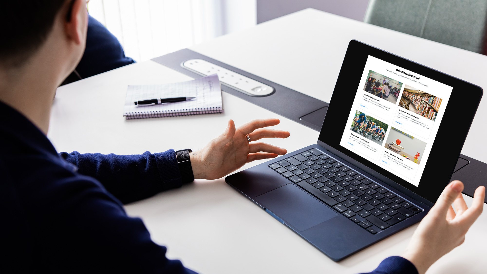
Video content can improve a school website when it is used well. A short welcome video, a tour, a subject area clip or a snapshot of school life can help parents picture their child there.
High-quality media galleries can help parents engage with school life, provided photo consent and safeguarding rules are followed.
A school website should look good, but it should feel human first.
Parents notice whether the site works well on mobile
A modern school website must be mobile friendly.
Many parents visit school websites on mobile devices. In practice, a large share of school website traffic now comes from phones. Parents may be checking dates in the car park, reading a page during a break at work or looking for contact details between school runs.
Mobile-friendly design adapts to any screen size.
Parents notice when:
- text is too small
- buttons are hard to tap
- menus are awkward
- tables break
- forms are difficult to complete
- large PDFs are hard to read
- pages load slowly
- images do not fit the screen
Effective school websites are mobile-responsive, secure and user-friendly.
If the site is hard to use on a phone, parents may give up. That matters for admissions, communication, trust and access.
Parents notice whether they can find things quickly
Parents usually visit a school website with a task in mind.
They might need to find:
- admissions information
- contact details
- term dates
- school policies
- SEND support
- safeguarding details
- lunch information
- uniform guidance
- curriculum pages
- performance data
- Ofsted inspection reports
- event dates
- a form
- a staff member
- payment information
- a calendar
Effective school websites provide clear navigation within two clicks for the most common tasks.
That does not mean every single item must sit on the homepage. It means the main routes should be clear.
Parents should not have to know the internal structure of the school to find what they need.
A clear layout helps parents get to the right information quickly. Intuitive navigation reduces frustration and makes the school feel more organised.
Parents notice contact details
Easy-to-find contact details improve communication with parents.
Parents should be able to find the school’s phone number, email address, address, contact form and key office details quickly.
Some schools can go further with a searchable staff directory. This can help parents contact the right member of staff without guessing.
For larger secondary school sites or academies, staff directories can be grouped by area, year group or department.
A parent should not have to search through several pages to find out who to speak to.
Clear contact routes reduce pressure on staff too. When parents can find the right person, office teams spend less time redirecting queries.
Parents notice admissions information
Admissions pages are one of the most visited areas of many school websites.
Prospective families want clear enrollment instructions. They want to know how to apply, when to apply, who to contact, what to expect and what the next step is.
Online admissions forms can streamline the registration process for new students. They can make it easier for parents to make an enquiry, book a visit, ask a question or express interest in a place.
A strong admissions area should include:
- how to apply
- key dates
- who to contact
- links to local authority information where relevant
- tour or open event details
- school prospectus information
- transition support
- FAQs
- clear calls to action
Parents notice when admissions information feels clear.
They notice when it feels confusing too.
If this is an area you want to improve, we’ve written more on how to structure a school admissions page that converts parents effectively.
Parents notice whether the website feels easy to manage
Parents may not think about the content management system behind a school website.
But they notice the results.
If the website is tidy, current and consistent, it usually means staff have tools that make updates manageable.
Websites should include easy-to-use content management tools. A good content management system helps staff update pages, add events, publish forms, refresh content and keep essential information current.
Effective websites reduce pressure on staff at the same time as informing families.
If the website is hard for staff to manage, parents often see the impact: outdated pages, old files, missing details and broken links.
Parents notice PDFs
Parents do not always say this directly, but too many PDFs make a website harder to use.
PDFs can be useful for policies, formal documents and some downloads. But they are often poor for everyday parent information, especially on mobile.
Avoiding excessive PDFs improves readability on mobile devices.
Key details should be embedded directly on web pages rather than hidden inside files.
For example, instead of placing all admissions information in one PDF, the school website should show the core information clearly on the page, then link to the full document where needed.
This helps parents read, search, translate and access the content more easily.
Parents notice accessibility
Websites must meet accessibility guidelines so families are not excluded from key information.
Accessibility is not just a technical requirement. It is part of good communication.
Parents, carers, staff, students and visitors may access the site with different needs, devices and levels of knowledge.
A school website should use:
- clear headings
- plain English
- readable text sizes
- good colour contrast
- alt text for meaningful images
- keyboard-friendly controls
- clear links
- accessible forms
- mobile-friendly layouts
- useful page titles
Content should be clear and in plain English to improve readability.
A school website serves the whole community. It should not make access harder for families who already need support.
Parents notice trust signals
Parents are looking for reassurance.
They notice details that help them trust the school.
Trust signals include:
- clear safeguarding information
- named leaders
- SEND information
- school policies
- Ofsted inspection reports
- performance data
- admissions guidance
- governance or trust details
- contact details
- recent updates
- real photos
- staff information
- pupil achievements
- clear support pages
School websites must publish specific information for compliance. For schools in England, this includes key details parents, inspectors and the wider community may need to access.
Ofsted ratings and inspection reports are a key part of school website compliance.
A modern, compliant website is vital for every school. It supports parents, school leaders, staff and wider accountability.
Parents notice school life
Parents want to know what the school feels like.
They want to see life, learning, events, pupils, staff, children and community.
A school website should act as the digital front door for its community. It should show the school’s unique character and help families picture what their child’s experience might be like.
This can include:
- classroom learning
- trips
- enrichment opportunities
- pupil work
- student achievements
- events
- clubs
- pastoral support
- community links
- values in action
- media galleries
- staff stories
- school council updates
Communicating student achievements builds community pride.
Parents want to see children being noticed, cared for and celebrated.
For many schools, the curriculum area of the website is one of the best places to show this in more depth.
Parents notice whether communication is joined up
A school website should be the main digital hub for communication and information.
Parents notice when things feel disconnected.
For example:
- an email mentions an event, but the calendar is empty
- a form is linked from an old page
- an app alert sends parents to unclear content
- admissions pages say one thing and PDFs say another
- contact details vary across pages
- a homepage does not link to key areas
Joined-up communication helps parents trust what they find.
An integrated calendar can help manage school closures and events. Parents should be able to find event details, key dates and updates from a clear area of the site.
The school website should hold the detail. Other channels should point to it.
Parents notice useful features
Features should make the site easier to use, not harder.
Useful features might include:
- online admissions forms
- contact forms
- searchable staff directory
- integrated calendar
- online payment system
- secure portals
- password-protected login areas
- media galleries
- event booking links
- AI chatbots for FAQs
- quick links
- homepage alerts
- online absence forms
An online payment system can reduce cash handling in schools.
Secure portals can allow access to private areas for grades, letters or sensitive documents. Password-protected login areas can give parents and students more real-time transparency where schools have that need.
AI chatbots can provide instant support for frequently asked questions, but they must be set up carefully, reviewed properly and limited to safe, accurate information.
The best features support parents and staff without making the site feel cluttered.
Parents notice homepage quick links
A dynamic homepage should showcase the school’s identity and give quick routes to key areas.
Useful homepage quick links might include:
- admissions
- term dates
- contact
- calendar
- safeguarding
- SEND
- policies
- parent information
- payments
- latest updates
- curriculum
- staff
- report absence
The homepage should not try to do everything.
Its purpose is to welcome people and move them quickly to the right place.
Parents notice whether the website feels secure
Parents are asked to trust schools with data, forms, contact details and personal information.
GDPR compliance is key for managing school website data.
Parents may not look for technical details, but they expect the site to feel safe and professional. Forms, portals, login areas and file uploads all need to be handled with care.
A secure, well-managed school website helps protect families and supports trust.
Parents notice details that feel wrong
Small issues can change how parents feel.
They notice:
- spelling mistakes
- broken buttons
- old names
- pages with no date
- missing content
- unclear forms
- poor mobile layout
- images that do not load
- duplicate pages
- confusing menus
- outdated policies
- links that go nowhere
- pages that say “coming soon” for too long
Each one may be small. Together, they shape the parent’s view.
A school website does not need to be perfect. It does need regular care.
What the best school websites get right
The best school websites are not always the most expensive or dramatic.
They are the ones that help parents.
They tend to have:
- clear navigation
- strong mobile design
- warm branding
- plain English content
- clear admissions routes
- easy contact details
- visible support information
- current compliance content
- accessible pages
- good photography
- useful features
- regular review processes
- a homepage that feels alive
- a content management system staff can use
The best school websites help people find what they need and feel good about the school at the same time.
A quick parent-view review
A simple review can show how parents experience the school website.
Ask someone who does not know the site well to complete these tasks:
- Find the admissions page.
- Find the headteacher’s name.
- Find term dates.
- Find the contact details.
- Find the SEND page.
- Find safeguarding information.
- Find school policies.
- Find Ofsted inspection reports.
- Find performance data.
- Find the calendar.
- Use the site on a mobile device.
- Find out what makes the school unique.
Then ask:
- Was it easy?
- Did it feel warm?
- Did the site build trust?
- Could you find key details within two clicks?
- Did the school feel current?
- Did the design make the school feel approachable?
This kind of review often reveals simple changes that can make a great difference.
What parents actually want from a school website
Parents want a school website that is clear, current and helpful.
They want to find information quickly. They want to feel reassured. They want to see the school’s unique character. They want to know their child will be supported. They want school communication to make sense.
They do not need a complicated website.
They need a useful one.
A strong school website supports first impressions, admissions, communication, parental engagement, compliance and day-to-day information management.
It helps current parents. It supports prospective parents. It saves time for staff. It shows the school at its best.
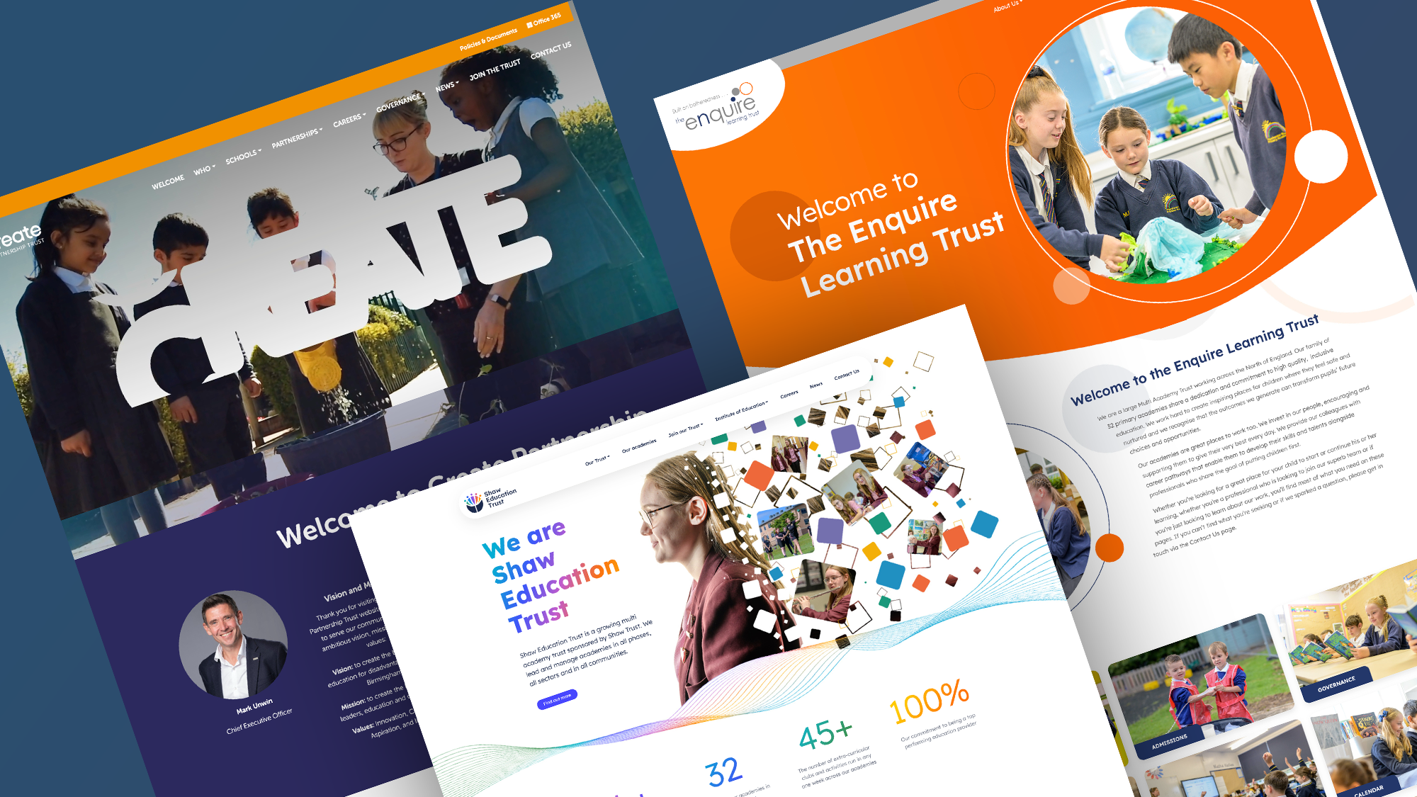
For multi-academy trusts, this same principle becomes even more valuable. A consistent approach to multi-academy trust website design helps every school present clear, useful and trustworthy information.
Need help reviewing your school website?
If your school website feels out of date, difficult to use or disconnected from how you communicate with parents, it may be time for a review.
At Schudio, we help schools and multi-academy trusts create school websites that are clear, warm, accessible, easy to manage and built around what parents actually need.
We can review your current school website and show you the practical changes that would make the biggest difference for families, staff and prospective parents.

Related Posts
Luke Smith
June 17, 2026
A school website newsletter is one of the simplest ways to keep parents informed, make ..
Luke Smith
June 8, 2026
Good school communication makes a real difference. It helps parents know what is happening. It ..

Luke Smith
May 13, 2026
School website pupil photos have always played an important role. They help prospective parents see ..
Ian Richardson
May 12, 2026
Your website is one of the most valuable student recruitment tools your school has. For ..
Luke Smith
April 27, 2026
If you spend any time reviewing school website pages across the UK, you start ..

Ian Richardson
April 16, 2026
If there’s one page on your website that really matters, it’s your school admissions page. ..


