Why Your School needs a Mobile-First School Website
Why Your School needs a Mobile-First School Website

A school’s website is often the first point of contact for parents, students, and community members looking for information about your school. With more and more people accessing the internet on their mobile devices, it’s essential that your website is optimised for mobile. Mobile first school website design should be your priority in any new school website project.
According to a recent report, mobile devices account for over half of all website traffic worldwide.
In the education sector, mobile usage is even higher. Studies show that up to 70% of website visitors use mobile devices.
Given these statistics, it’s clear that schools need to prioritise mobile optimisation when designing their websites.
And the best way to do this is through a mobile-first design approach.
What is Mobile-First Design?
Mobile-first design is an approach to web design that prioritises the mobile experience.
Instead of starting with a desktop design and scaling down to smaller screens, mobile-first design starts with the mobile version of the website and then expands it to work on larger screens.
The idea behind mobile-first design is to focus on the mobile experience first. Mobile-first design improves the experience for touch-based navigation and slower internet speeds of mobile devices. This can result in a faster, more intuitive, and more user-friendly website for your school community.
Why you need a Mobile-First School Website
There are several benefits for schools to use a mobile-first design approach for their websites:
- Improved User Experience: With more and more website visitors accessing the internet on their mobile devices, a mobile-first approach ensures that your school’s website is optimised for the best possible user experience on these devices. This can lead to higher engagement and better overall satisfaction among website visitors.
- Higher Search Engine Rankings: Google and other search engines have prioritised mobile-friendliness as a key factor in their search algorithm. By using a mobile-first approach, your school’s website is more likely to rank higher in search results. Mobile-first design ensures your website can be discovered by potential students, parents, and other stakeholders.
- Increased Accessibility: Mobile-first design prioritises simplicity and ease of use, making your school’s website more accessible for all users. This includes those with disabilities or limited technical knowledge.
- Better Cost-Effectiveness: A mobile-first design approach can be more cost-effective than a traditional desktop-first design. This is because it prioritises the most important content and features, leading to fewer design iterations and revisions.
- Future-Proofing: With mobile devices continuing to dominate internet usage, a mobile-first design approach ensures that your school’s website is prepared for the future and able to adapt to evolving technologies and trends.
By using a mobile-first design approach, schools can create websites that are optimised for today’s mobile-centric digital landscape. You will also future-proofing your online presence and improve accessibility, search engine rankings, and overall user experience.
Choosing a Mobile-First Website Design for Your School
Consider working with a web design agency that specialises in mobile optimisation for schools if you’re unsure about how to get started. They can help you create a website that meets the needs of your school community and stands out in today’s mobile-centric world.
Tips for Mobile-First Website Design for Your School
When designing your school’s website with a mobile-first approach in mind, there are a few key tips to keep in mind:
- Simplify Navigation: Mobile users typically prefer simple and intuitive navigation, so make sure your website’s menus and navigation are easy to use and understand.
- Optimise for Speed: Mobile users are often on-the-go and have limited data plans, so make sure your website loads quickly and is optimised for mobile data usage.
- Prioritise Content: When designing for mobile, it’s important to prioritise the most important content and make it easy to access. Consider using collapsible menus or hiding less important content to save space.
- Use Responsive Design: While a mobile-first approach is essential, it’s still important to ensure your website looks great on all devices. Using a responsive design approach can help ensure your website adapts to different screen sises and devices.
By keeping these tips in mind, you can create a mobile-first website design that meets the needs and preferences of your school community.
Common Mistakes When Building Mobile-First School Websites
- Excessive Content: Mobile screens are smaller than desktop screens. So, it’s important to prioritise the most important content. You will then avoid excessive or unnecessary content that can clutter the screen and make it difficult to navigate.
- Small Font Sizes: Small font sizes can be difficult to read on mobile devices. Make sure to use a font size that is easily readable on small screens.
- Complex Navigation: Complex or convoluted navigation can make it difficult for users to find what they’re looking for on a mobile device. Keep the navigation simple and intuitive, and avoid using too many menus or submenus. Schools are prone to never-ending additions of content. Fight this urge! Keep your website content tidy and limited to the content you need.
- Unoptimised Images and Media: Large images and videos can slow down your website’s load time and use up mobile data. Make sure to optimise your media for mobile devices by compressing images and videos and using appropriate file formats.
- Non-Mobile Friendly Forms: Forms that are not optimised for mobile can be frustrating to use on a small screen. Make sure to use mobile-friendly forms that are easy to use and navigate.
- Pop-ups and Ads: Pop-ups and ads can be annoying on desktop screens, but they can be even more intrusive on mobile devices, where screen real estate is limited. Avoid using pop-ups and ads that disrupt the user experience.
By avoiding these common pitfalls, you can create a mobile-first school website that provides an optimal user experience for all visitors, regardless of their device.
The Importance of Testing and Iteration
Finally, it’s important to remember that mobile-first website design is an iterative process. Make sure to test and optimise for a good mobile experience, even after it is launched.
Tools like Google Analytics and user feedback can help you identify areas for improvement and refine your website’s design over time. By continuously testing and iterating, you can ensure your school’s website remains optimised for the ever-evolving mobile landscape.
Our Approach to Mobile-First School Website Design
At Schudio, we believe in taking a mobile-first approach to website design for schools. By prioritising mobile devices, we ensure that your website looks great and functions smoothly on any screen size.
We keep our designs simple, clear, and easy to navigate. This ensures that your visitors can find the information they need quickly and easily. We also prioritise speed, using optimised images and code to ensure fast load times on mobile devices.
To ensure that your website is accessible to all users, we design with accessibility in mind. We make it easy to use for people with disabilities or limited technical knowledge. We also test your website on multiple devices. This includes smartphones and tablets of different sizes and operating systems, to ensure that it looks and functions as intended.
By taking a mobile-first approach, we help your school stand out in today’s mobile-centric digital landscape and provide an optimal user experience for all visitors, regardless of their device.
In conclusion, a mobile-first website design is essential for all schools. This way, you will guarantee the best possible experience for your website visitors.
Prioritise mobile optimisation, simplifying navigation, optimising for speed, prioritising content, and using a responsive design. Then you will create a website that meets the needs of your school community and stands out in today’s mobile-centric world.


Related Posts
Luke Smith
June 24, 2026
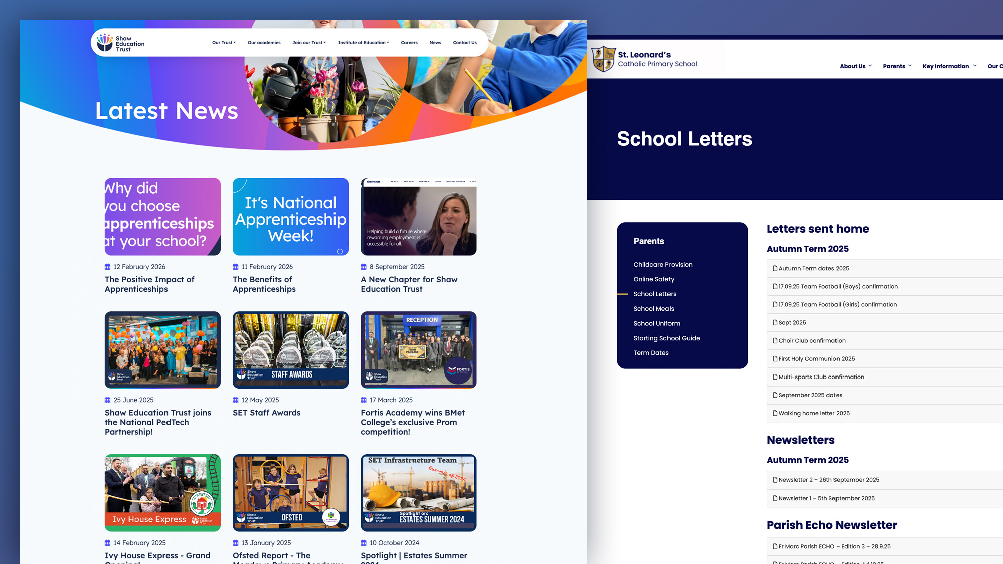
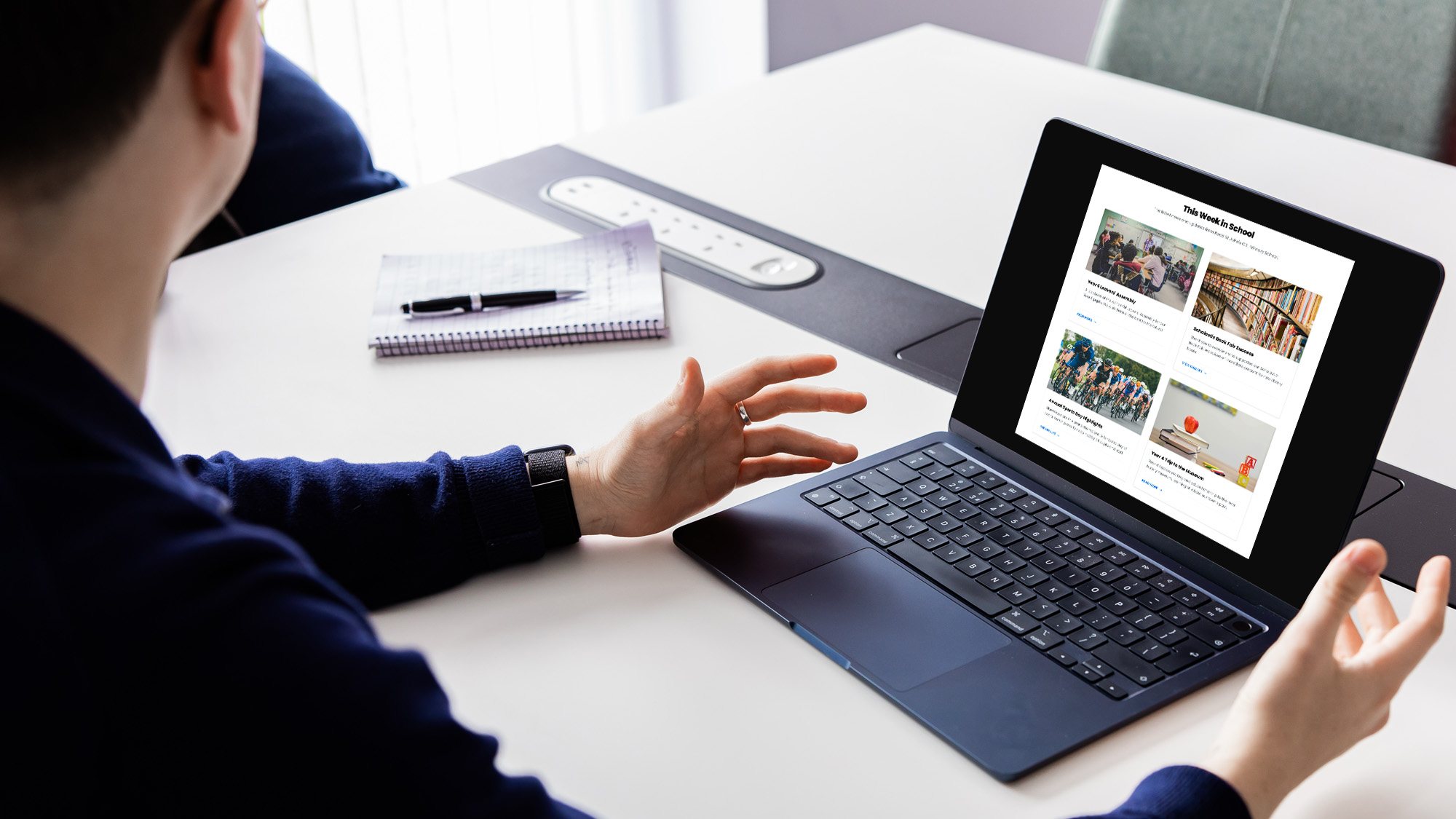
School website news is one of the easiest ways to show parents, pupils and prospective ..
Luke Smith
June 17, 2026
A school website newsletter is one of the simplest ways to keep parents informed, make ..
Luke Smith
June 8, 2026
Good school communication makes a real difference. It helps parents know what is happening. It ..

Luke Smith
May 13, 2026
School website pupil photos have always played an important role. They help prospective parents see ..

Ian Richardson
May 12, 2026
Your website is one of the most valuable student recruitment tools your school has. For ..
Luke Smith
April 27, 2026
If you spend any time reviewing school website pages across the UK, you start ..


