Your Website Visitor Journey & How to Guide Them
Your Website Visitor Journey & How to Guide Them

We’re continuing our series on the Power of Rich Media on your School Website. Hugely useful tools, such as Google Analytics give you valuable insights into how users are navigating your school website. Schools that take the time to understand the basics of using a tool like GA reap the rewards.
But what options are there within your school website that allow you to influence the way users interact and navigate through your website?
Well there are three key areas and your school or college website software should make this really easy for you.
Navigation & Structure
The structure of your site is arguably the most vital element to get right on your website. Here’s a handful of golden rules that will make a big difference.
- Structure Strategically – from the outset ensure that your content is structured in a way that is rational, easy to find your way around and puts the information that your users are most interested in front and centre.
- Never add an additional page on a whim – schools are often under pressure to add content quickly. That’s not an excuse to not put just a couple of minutes thought into it. If you need to add a Policy add it to a policy page (use Schudio Document module for best practice). Never add a page and extend your menus for one small piece of content; add it to an existing page or combine pages to keep things tidy.
- Run an annual review – with the best will in the world things slip away from all of us. So plan a few hours once or twice a year to keep on top of things. Your website partner will be able to help with this if you ask them.
Related Content
Think about the last time you shopped online. Have you noticed how most online stores display related products while you’re browsing? The idea is that they can directly influence your shopping to steer you towards content that you are likely to be interested in. The result is that you spend more time on the site, you get a broader range of products, you think the site (and by relation the company) is helpful. It can powerfully impact on your likelihood of engaging more with a company, even making you more likely to buy.
A good school or college website will display related content.
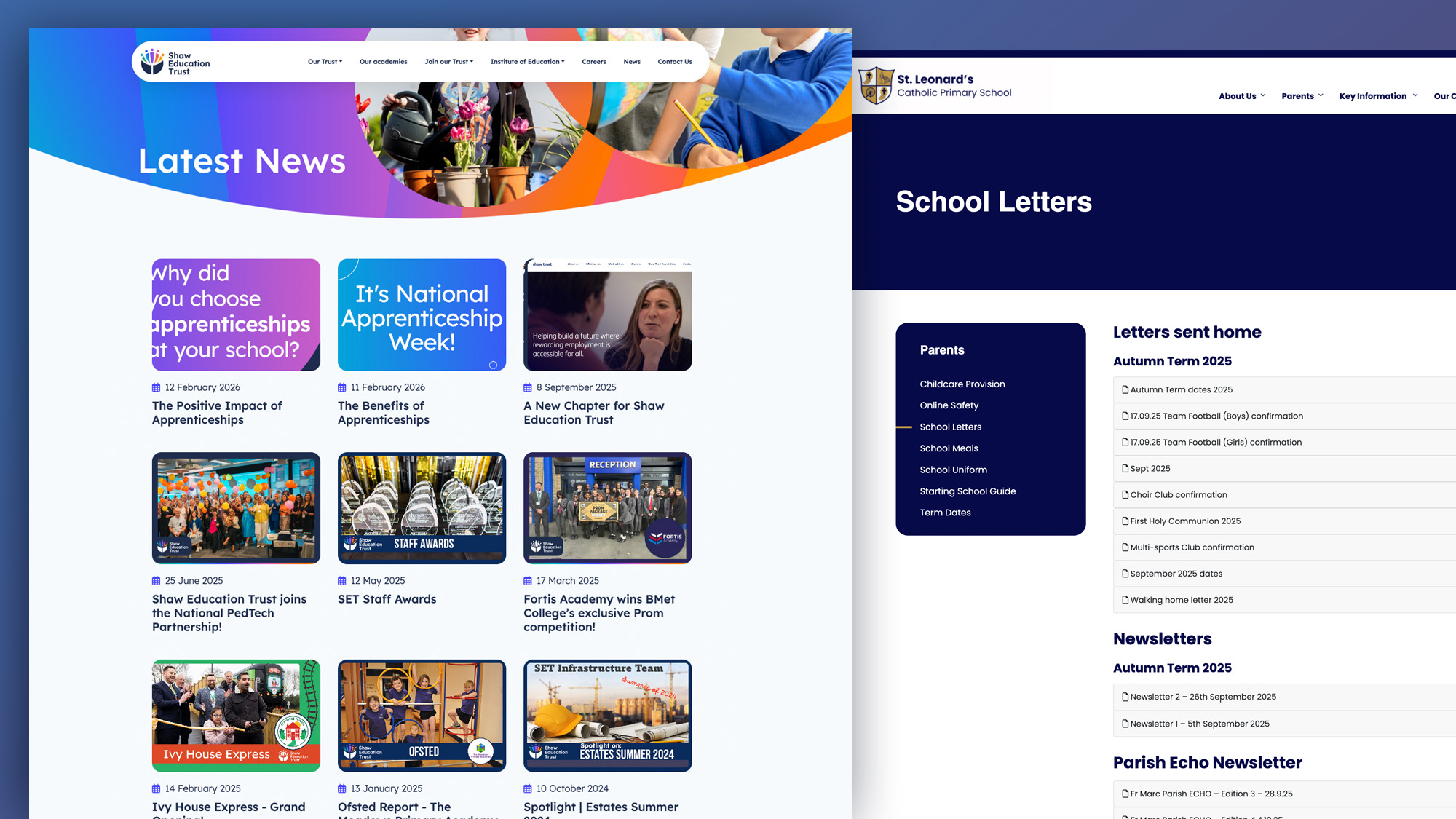
How does that work in practice. Have a look at this page on Astley Park School in Lancashire. This is simply a class page that is super easy to keep up to date. One of the key elements of the page is nearer the bottom, the ‘Related News’ section. On key sections of your website, if you have the option, link to related news articles and you’ll find users engage with more and more content.
The Schudio School Website software makes that incredibly easy. Simply add your news and add a ‘tag’ relevant to your Class our Course and the software will do all the work for you.
Splash Images
There’s potential for images that pop up on websites to be incredibly annoying! A splash image is one that appears when a user loads a page that they have to close down to view the page. It’s easy to see why they’d be annoying but, used sparingly and strategically they can be hugely beneficial to users. They can also give you power to direct users to really important pages, such as key events. Your school website software should give you the option to add splash images which link to any page on your website.
It’s also really important to have built in settings that mean the images won’t display every time a user loads every single page, or even every time they visit your website. Also, a little word of warning; only use them for the really important events that you want to push users towards at very limited times of year. Don’t use them all year round!
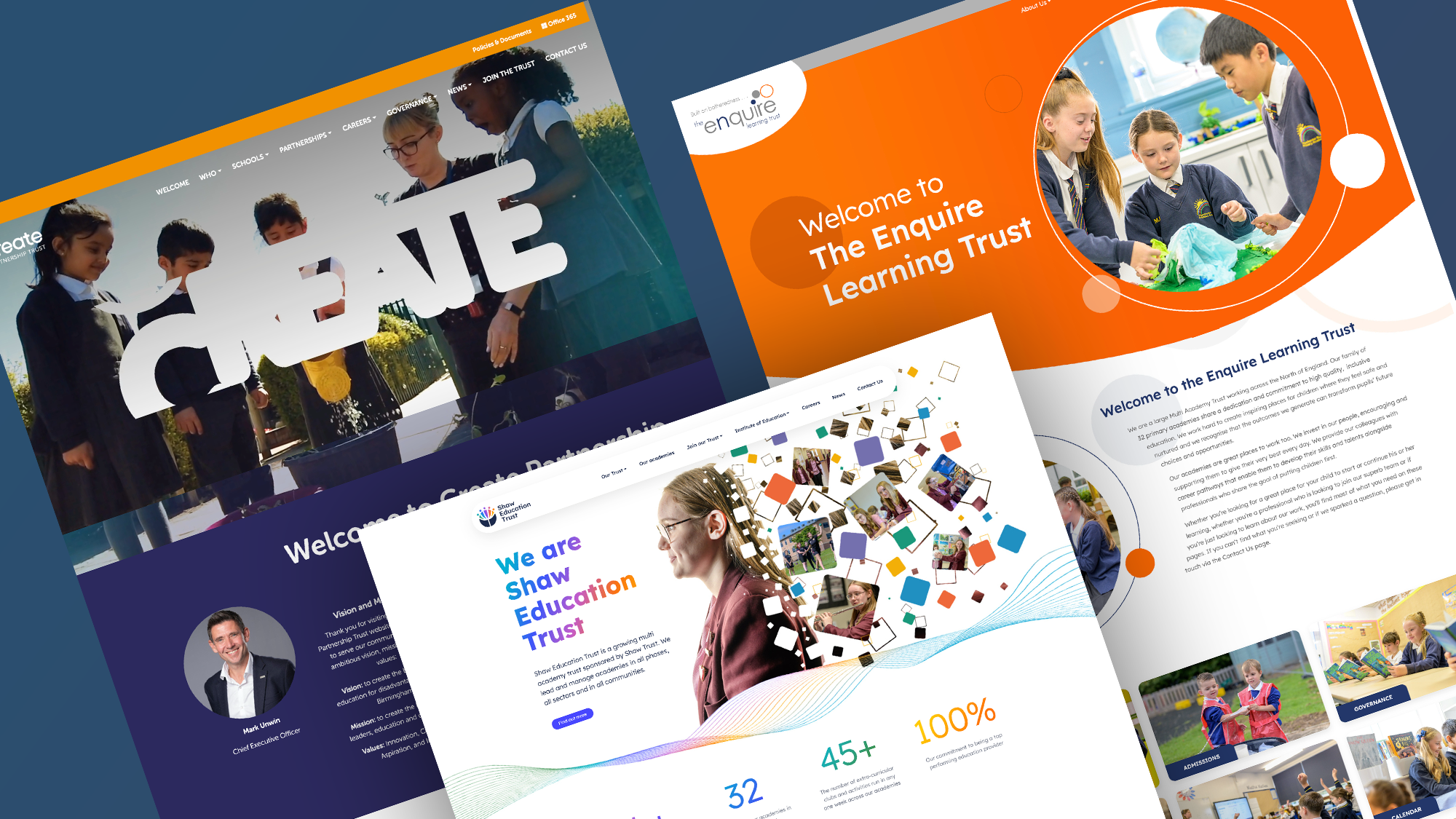
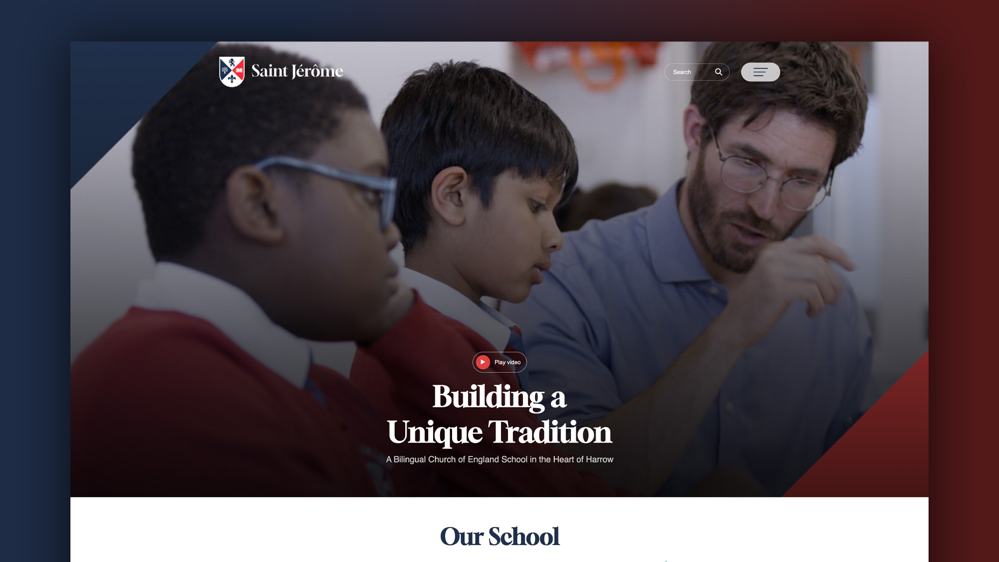
Banners / Leader Images
The big photos or graphics in prime position on your homepage are among the most viewed elements of your entire website. It’s really important to get them spot on. Using great photos as a rule works wonderfully well at drawing users into your website content. If you want to take it up a notch, use great graphics in these positions to drive users to the places you want them to get to.
One key point here though. ‘Banner blindness’ is a real thing. It’s the phenomenon where users don’t see past the initial scrolling banner on your website, especially if it’s a banner rather than a series of images. They simply won’t see any banners beyond the first one. So the best advice is, use with caution.
As with everything, using rich media can have a hugely positive effect on how users engage with your website. Take the time to think through how you will see the best results but it’s always worth trying new things, see how they perform and then improving as you go.

Related Posts
Luke Smith
June 24, 2026
School website news is one of the easiest ways to show parents, pupils and prospective ..
Luke Smith
June 17, 2026
A school website newsletter is one of the simplest ways to keep parents informed, make ..
Luke Smith
June 8, 2026
Good school communication makes a real difference. It helps parents know what is happening. It ..

Luke Smith
May 13, 2026
School website pupil photos have always played an important role. They help prospective parents see ..
Ian Richardson
May 12, 2026
Your website is one of the most valuable student recruitment tools your school has. For ..
Luke Smith
April 27, 2026
If you spend any time reviewing school website pages across the UK, you start ..


