Why Pencil Buttons on School Websites are Bad
Why Pencil Buttons on School Websites are Bad

It’s quite surprising how often we have conversations with parents, students and teachers about their school websites, only to find that they have different coloured pencils as buttons.
Indulge me while I attempt to explain why pencil buttons are bad … so very, very bad.
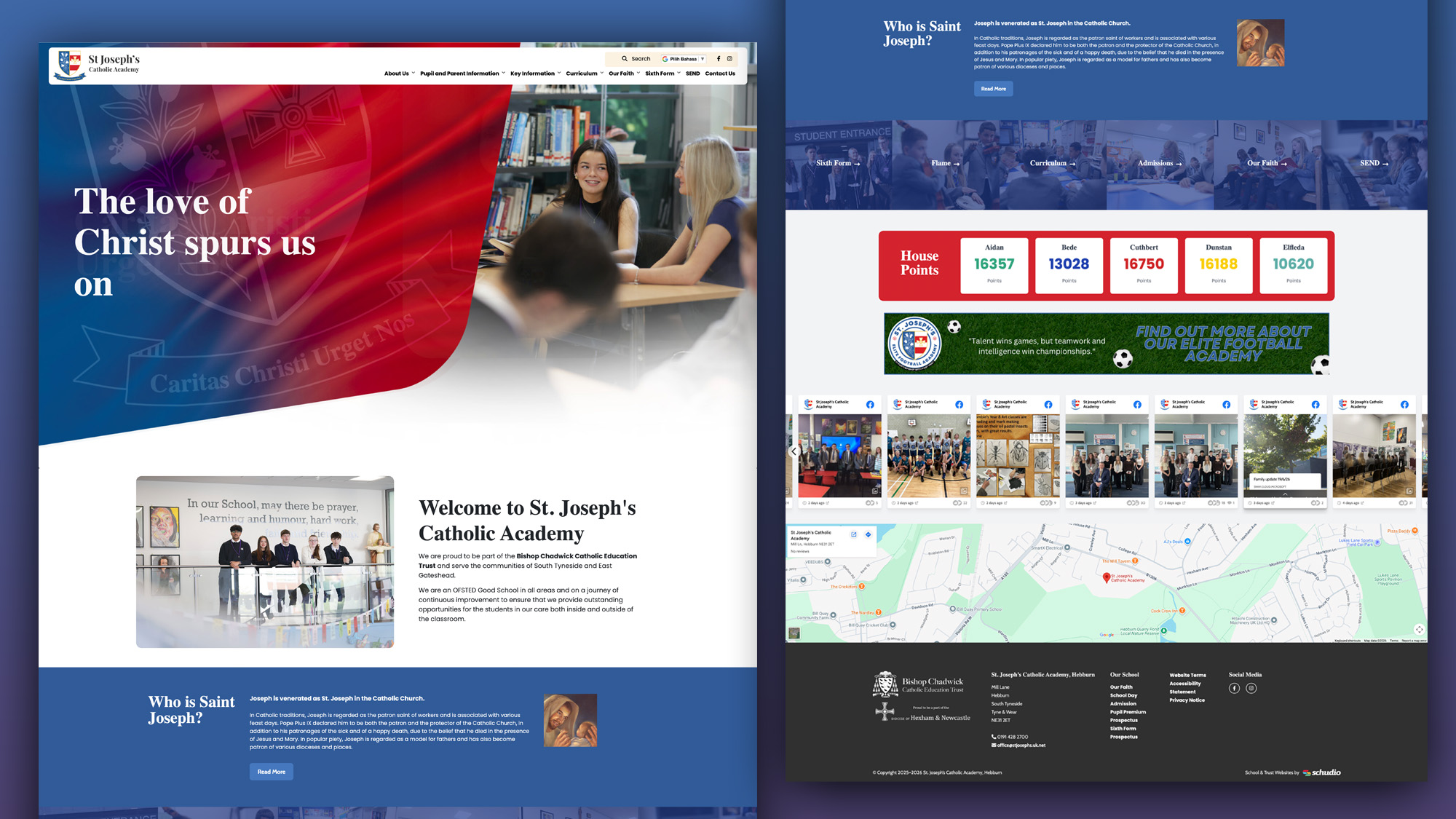
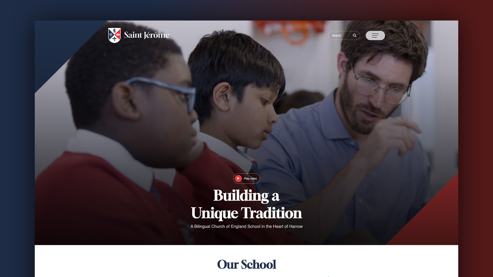
I’ll get my prejudice out of the way immediately – they look bad. Of course something looking bad is subjective, but where else do you look online to see buttons that are a wide range different colours, sometimes different shapes, and then find it easy to interact with that website? Does that site work on your iPhone? Or your S3?
From the primary school’s point of view, very often the key stakeholder believes that having pencils for buttons and a wide array of colour will appeal to their students. They’re probably right.
The only issue with that is their primary school website isn’t aimed at the students. The people who visit a primary school website are the parents (if you’re lucky), prospective parents and, every blue moon, Ofsted.
These users are all looking for information; sure they’ll fully engage with a site bursting with up to date information, events and beautiful pictures. But if the information that they’re looking for isn’t easy to find and the instruments you use to entice that user to browse your site are clunky and obstructive the best outcome will be that the user doesn’t have the best experience of using your site. The worst outcome is that they’ll leave immediately.
Have a think about who your school website is REALLY aimed at and build your site content and design accordingly.
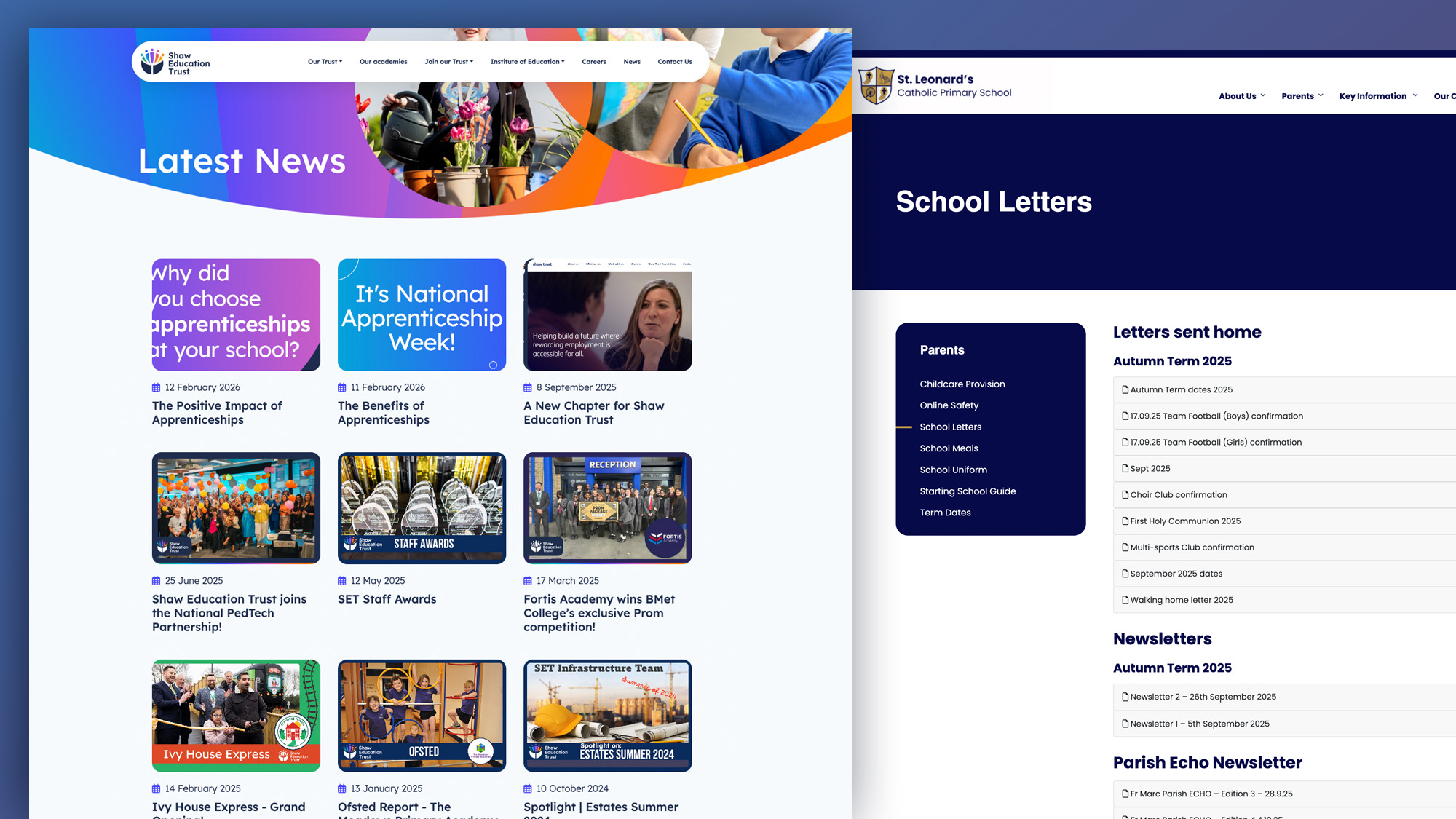
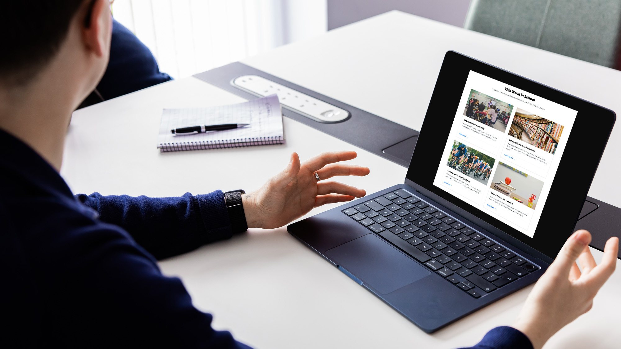
A parent wants to be able to access key pieces of information very quickly. What are the key pieces of information that they’re looking for? Term dates, contact details, weekly newsletters.
Of course they’re interested in what their children are up to at your school and regularly updated class pages and rich content of recent events will keep parents coming back, but if the basics aren’t easy to use and easy to find, engaging them in using all the content you want them to see becomes infinitely more difficult.
So what do we do? How do we make sure that our site is engaging but clear to navigate without being deathly dull?
Let the content drive your website forward. Use rich media, use images, video, flip books, online newsletters and all the dynamic content that keeps your parents engaged. But do not shy away from making sure that the functionality and usability is taken care of FIRST. Your users want to know they can access the content on your site.
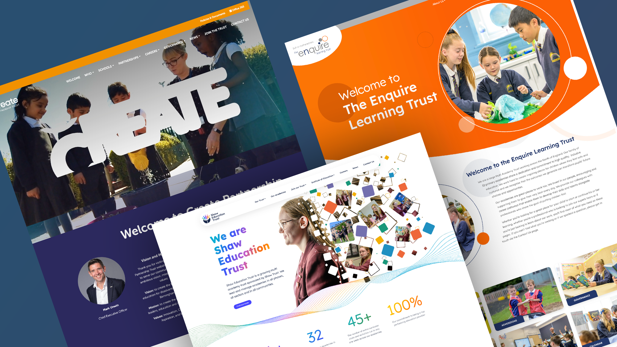
Choose colours that match your branding, use well thought out and planned navigation structures and keep your buttons simple. Let the content drive your school website.
Keep background colours simple so that when you add images to the content the background doesn’t clutter the layout of the page and images and content are easy to read.
The main argument here, is that there is no good reason that your school website, with whatever budget you may have, shouldn’t be simple to use, easy to navigate and full of useful, engaging content that will work on any device.

Related Posts
Ian Richardson
June 24, 2026
A school website says a lot before a parent reads a full page. Parents make ..
Luke Smith
June 24, 2026
School website news is one of the easiest ways to show parents, pupils and prospective ..
Luke Smith
June 17, 2026
A school website newsletter is one of the simplest ways to keep parents informed, make ..
Luke Smith
June 8, 2026
Good school communication makes a real difference. It helps parents know what is happening. It ..

Luke Smith
May 13, 2026
School website pupil photos have always played an important role. They help prospective parents see ..
Ian Richardson
May 12, 2026
Your website is one of the most valuable student recruitment tools your school has. For ..


