The Truth about Responsive School Website Design
The Truth about Responsive School Website Design

If you’re reading this blog post, chances are you’re looking into responsive school website design.
Responsive school website design is about ensuring the website will look the best it can. Regardless the size of device trying to load it. The website design should display optimally for the requested size. There’s no need to zoom in or scroll left and right when viewing a good responsive website on a mobile phone. It will fit the size of the screen perfectly.
So, why do you need a responsive school website design?
From our data, school website mobile browsing now represents around 60% of all traffic to school websites. We’re surprised at how rare responsive website design is within schools, and a responsive design will certainly make your school stand out from the crowd.
With this proportion of visitors browsing your website from their phone or tablet it’s more important than ever to make sure you can effectively present information on your website. And to do so in a way that makes it easy for your audience to read and engage with. A responsive school website design is a surefire way to help do that. The design will help keep content within the boundaries of the device browsing the website providing a much more straightforward user experience. Buttons and menu structures should be easy to navigate on a responsive design. Designed with all devices in mind there should be no functionality that compromises the visitor’s experience on their mobile phone. Nothing that puts a negative on the way your school appears online.
It’s also worth taking note of the ‘readily accessible’ statutory requirements. While these may not explicitly say you must have a responsive website we believe things are certainly heading in that direction. Read our blog WHY YOUR SCHOOL WEBSITE MUST BE RESPONSIVE
What about your users?
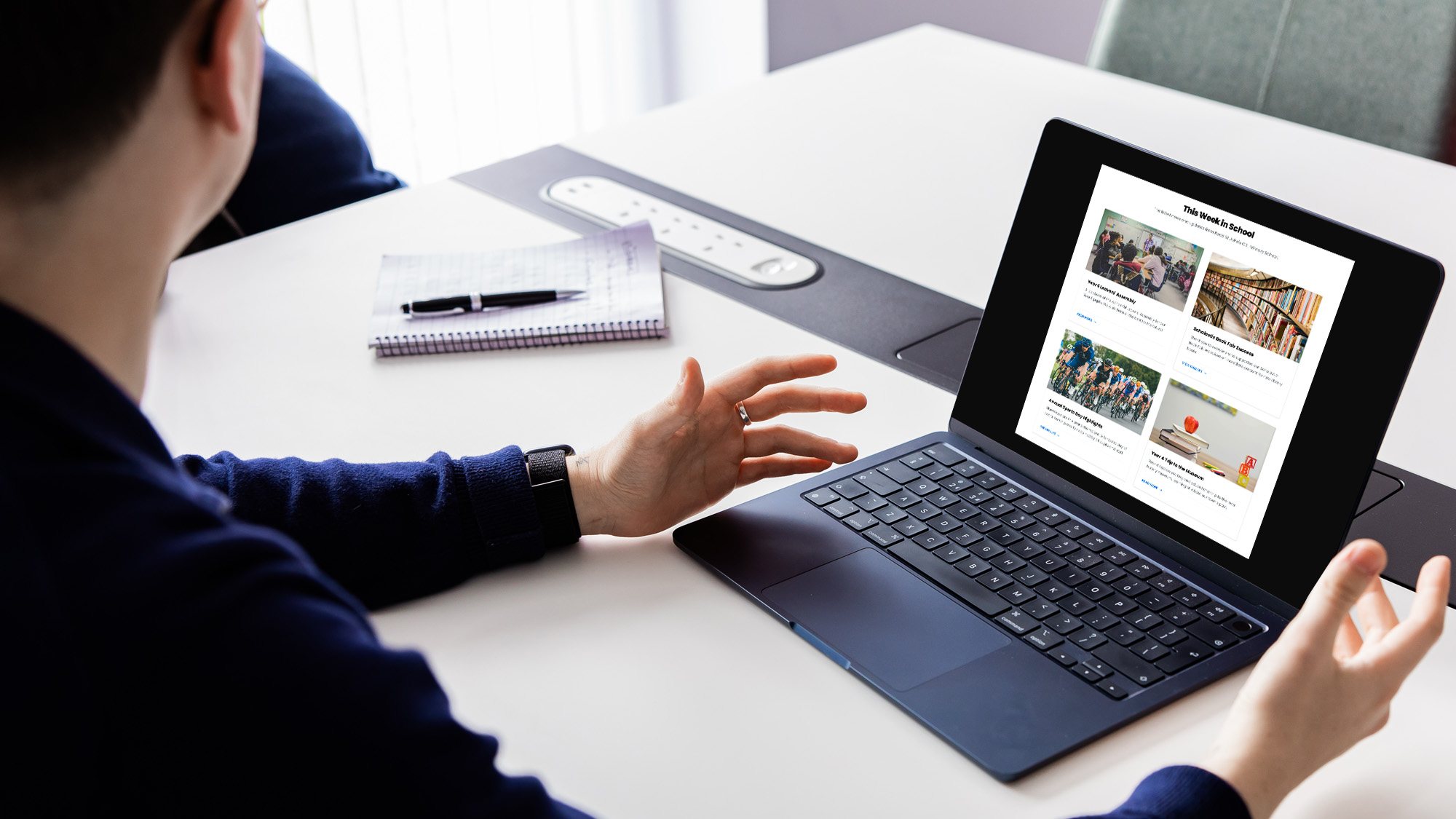
We’ve mentioned above about the visitors to your website. And ultimately they are the target audience of most school websites. But to make an attractive website, with regularly updated content. Content that parents can engage with, you’ll need people to keep the website filled with the stories of your school. Not only is every website we build a responsive school website design, but our own Schudio School Website Software is responsive too! Read more about it here, to see how a responsive CMS can make it easier and faster to update your website with engaging content.
More than just a responsive school website design
A responsive school website design will make your website content more easily accessible to mobile and tablet device users. But the content displayed does matters too.
There is some content that has traditionally been used on websites, but doesn’t often play nicely even with a responsively designed website. Flash for example. Steve Jobs of Apple famously took a firm stance in not allowing flash onto the iOS platform back in 2010. However we do still see some examples of flash in websites even now. Most devices now (never mind just mobile) won’t be able to view Flash content without changing some settings. Adobe themselves have announced the end of life date for Flash as 2020. As a result our recommendation is to stay well away from Flash content, and use more modern and accessible technologies instead.
Considerate use of documents is also important when dealing with responsive school websites. There are lots of documents that are made available from a school website. How these are viewed and opened is often a source of frustration for visitors. This can be documents that open in the same window, or even documents that require opening in a separate window. This links with the point earlier about the ‘readily accessible’ school website requirements. Read more about the Schudio solution for displaying documents.
The very best responsive content
We noted that it’s not that all that common for schools to have responsive websites. However in some other sectors everyone has a responsive website. This means that there’s lots of additional functionality available when using a mobile responsive website to optimise content even further for your visitors.
Most responsive websites are built within a framework. These frameworks have additional tools and functions within them to enhance your content. To present content well on traditional desktop devices, but also effectively display the same information when on a smaller screen. At Schudio all of our school websites are responsive and we use the Bootstrap framework.
Some examples of ways to improve your content and advance your website are available in previous blog posts below:
We also run a regular training session for our clients called Advancing Your Website. This sessions covers how to make the most of your responsive school website design, and improve your website. See a list of our upcoming training sessions here.


Related Posts
Luke Smith
June 24, 2026
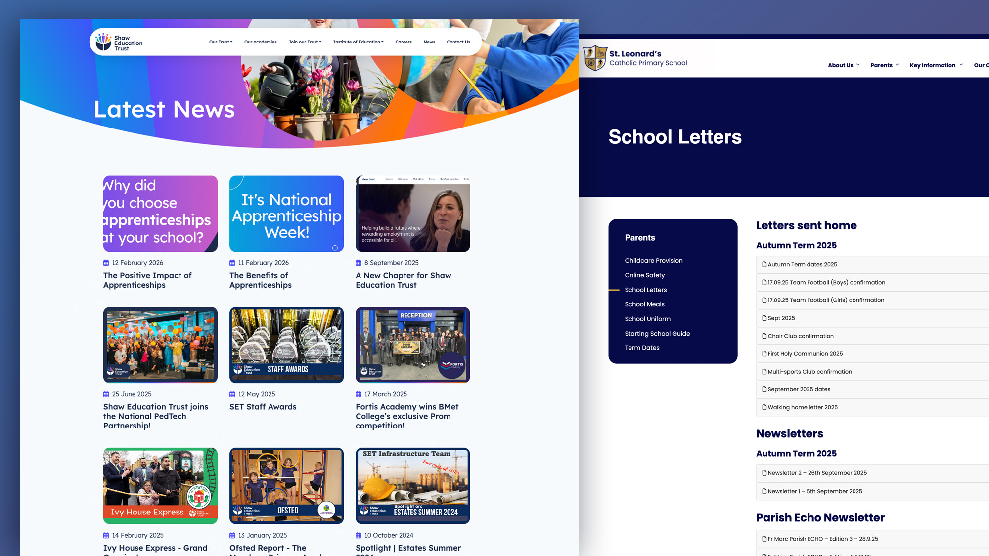
School website news is one of the easiest ways to show parents, pupils and prospective ..
Luke Smith
June 17, 2026
A school website newsletter is one of the simplest ways to keep parents informed, make ..
Luke Smith
June 8, 2026
Good school communication makes a real difference. It helps parents know what is happening. It ..

Luke Smith
May 13, 2026
School website pupil photos have always played an important role. They help prospective parents see ..
Ian Richardson
May 12, 2026
Your website is one of the most valuable student recruitment tools your school has. For ..
Luke Smith
April 27, 2026
If you spend any time reviewing school website pages across the UK, you start ..


