Ben Bedford
Problem solver and innovator. Ben oversees new website projects and is always looking for new features to improve the Schudio School Website CMS.


I expect it's a mixed bag! But why?
Because we all visit different websites. Some have spent lots of time ensuring their site looks the best it can on whatever device you're on, some appear to have spent no time. Mobile browsing is a big change from the traditional way of browsing, logging on to your computer, often in a different room. Instead we are instantly on and instantly reading. The problem comes when the website has not changed with the times, when you have to pinch and pull the webpage around on your device to read the content, the instant process is interrupted and made into an awkward and annoying one.
Web browsing from mobile devices has now overtaken traditional desktop browsing. It's not just true in education but also across other areas of the web.
In online retail, mobile traffic made up just 3% of all visits in 2010. By September 2014 this had increased to over 50%. A number of high profile news outlets (including the BBC) also receive over 50% of their web traffic via mobile devices. The landscape has changed and your website needs to be available on every device.
So what are the options to stay relevant and accessible? I've listed 3 below, and I'd recommend doing them all.
 Responsive Website Design
You don't have to create a whole new mobile site that has to be separately managed and is vastly different from your main site. A responsive website design can be the solution, it's a website that automatically changes to fit the device that's being used. Every site that we create is designed responsively, so you know it will look great whatever device the site is being viewed on.
TIP: If you're on your computer and you want to check a website's responsiveness, just drag the browser window in to make it narrow like a mobile device. If the site is responsive, it will respond and give you the new layout. If not you'll have to scroll across the page, and probably zoom in to see all the content.
 App
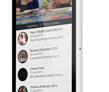
AppAnother option is to look into an App. Statistics show that 89% of consumers use Apps over mobile websites. Apps are great, they get you straight into the content that you want to see, with a tailored experience especially for your device. There is a FREE Schudio School App available for anyone who wants to use it. Once setup the app will pull unique information from your school, the same information that is displayed on your Schudio website. (The app is still available for those not currently using Schudio for website services, content will just have to be updated on the app as well as on your existing website instead of just once).
You can find more information and sign up for your FREE School App here
When thinking about how accessible your site is, the site structure and content plays a big part. An easy way to offer that greater experience to your visitors, including parents and also OFSTED is to go through and check your site, check that you are meeting the OFSTED requirements, and improve your site. You will undoubtedly find things that can be changed to improve the user experience, and that user experience should be undertaken on both mobile and desktop devices.
Get a free OFSTED Ready Website Report today and check your website in detail.
Simply add your email and you'll get expert advice weekly, direct to your inbox.

Problem solver and innovator. Ben oversees new website projects and is always looking for new features to improve the Schudio School Website CMS.
